


The Stock Market Grand Illusion
Stock-Markets / Stock Markets 2016 Nov 04, 2016 - 01:05 PM GMTBy: Tim_Wood

 Many know that the economy is not good. Fact is, the economic issues actually began in 2000 and have only been made worse. The world economy is in a systemic crisis and I am going to show you the stock market bubble that has resulted from the attempts to resuscitate the underlying economy.
In spite of equities’ push to a new high in 2007 and again in 2015/16, I have maintained all along that the secular bull market peaked in 2000, along with the underlying economy. The first attempt at stimulating the economy and resurrecting the secular bull market came in the wake of the decline into the 2002 4-year cycle low. Those efforts resulted in what was at the time the longest cyclical extension since the inception of the averages in 1896, which in turn resulted in a banking crisis, a commodity bubble and a housing bubble. Then, when the extended cycle finally began to roll over the end result was the worst financial crisis since the great depression. Yet, the response to the worst financial crisis since the great depression was an even more extreme version of the same policies that created the problem in the first place.
This time, the resuscitation efforts have, for the most part, failed to stimulate the economy and the results have been the creation of an equity bubble. In 2015 the equity markets began what is still a ginormous topping process. Following the initial decline into the August 2015 low, I said that there would be false bottoms and false rallies. Since the topping process first began in 2015, we have had three intermediate-term declines and three intermediate-term advances. Admittedly, I did not anticipate the extent or duration of these counter-trend rallies being what they have been. However, in spite of the duration of these rallies, they have not changed the fact that the advance out of the 2009 low has been the most extended cyclical advance since the inception of the Dow Jones Industrial Average in 1896 or the resulting bubble. In spite of the duration of the overall advance out of the 2009 low or the three intermediate-term advances that have followed in the wake of the August 2015 low, there has still been no meaningful affect on the underlying technical or fundamental data, much less the underlying economy. The three intermediate-term declines and recoveries have caused great confusion while creating an environment of enormous complacency. The third intermediate-term advance within this topping process carried the Industrials to a new high in August 2016. Many called that move at the time a “breakout.” I told my subscribers then that it was a “fakeout” and that it would likely prove to be the biggest bull trap of all time. Since the August 2016 high the markets have flatlined, which in turn generated even more complacency, frustration, deception and confusion. I now want to take a moment to stand back and look at the bigger picture. I will then lay out the expectations for the inevitable unwinding. All in all, it is still part of a very large and very ugly top.
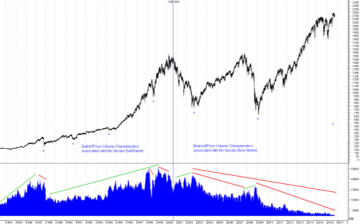
Let’s first look at a chart of the S&P 500, which can be found at the top of page 3. In Technical Analysis of Stock Trends, Edwards and Magee wrote, “Volume goes with the trend- Those words, which you may often hear spoken with ritual solemnity but little understanding, are the colloquial expression for the general truth that trading activity tends to expand as price moves in the direction of the prevailing Primary Trend. Thus, in a Bull Market, volume increases when prices rise and dwindles as prices decline; in Bear Markets, turnover increases when prices drop and dries up as they recover.”
Between 1982 and 2000 volume expanded as price rose and contracted on the declines, which was clearly bullish behavior in association with the underlying secular bull market. But, look how the bullish price/volume relationship began to change, in that volume began to expand as price declined into the 2002 low and it began to contract as price moved into the extended 2007 4-year cycle top. Then, look how volume expanded as price moved down into the 2009 extended 4-year cycle low. Following that low the bearish volume behavior was further confirmed even with the declines into the 2010 and 2011 lows. But, then in 2015/16 as price went parabolic into those tops volume continued to shrink, which again is indicative of a secular bear market rally. The point of these charts is to show you that in spite of the duration of what is now THE most extended 4-year cycle advance in stock market history, the price/volume behavior remains bearish.
While the 4-year cycle has historically averaged 48.11 months since the inception of the Dow Jones Industrial Average in 1896, since the 2002 4-year cycle low we have seen two very extended 4-year cycles, with the current extension being even greater than the last. But, in spite of the ongoing and greatest coordinated global intervention efforts in the history of the stock market, these efforts have failed to change this underlying basic price/volume behavior, even with the most recent three intermediate-term advances. So, again, in spite of the fact that we have seen not one, but two of the longest 4-year cycles in history, I maintain that we have been operating in a secular bear market since 2000. One may ask, given that we have seen new highs, what difference does it make whether we call these two extended 4-year cycle advances bull markets or rallies within a bear market? The result is all the same, right? Wrong! The difference is that like the extended rally into the 2007 top, it was not organic. It was manufactured and it lacks the very underlying foundation of secular bullish volume. The extended advance into the 2007 top was a manufactured/synthetic event that imploded and while the current advance has stretched further than ever imagined, my belief all along has been that this time will be even worse.
Next, I want to look at the Velocity of M2 chart. This chart can be found at the bottom of page 3. First I want to draw your attention to the fact that there was a divergent top that occurred in conjunction with the 2000 top in equities, which clearly telegraphed the peak in the underlying economy and which I feel was also suggestive of the secular bull market top. These two pieces of data are related. Next, I want to point out that the liquidity campaign policies associated with the 2002 to 2007 extended 4-year cycle were able to positively influence the Velocity of M2 in that it did turn up in early 2003.
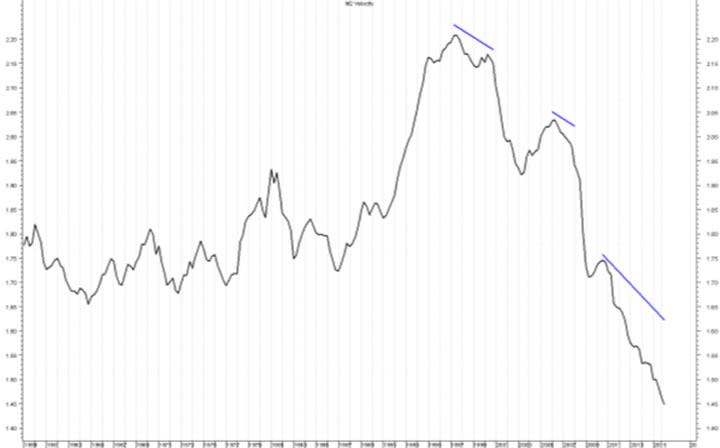
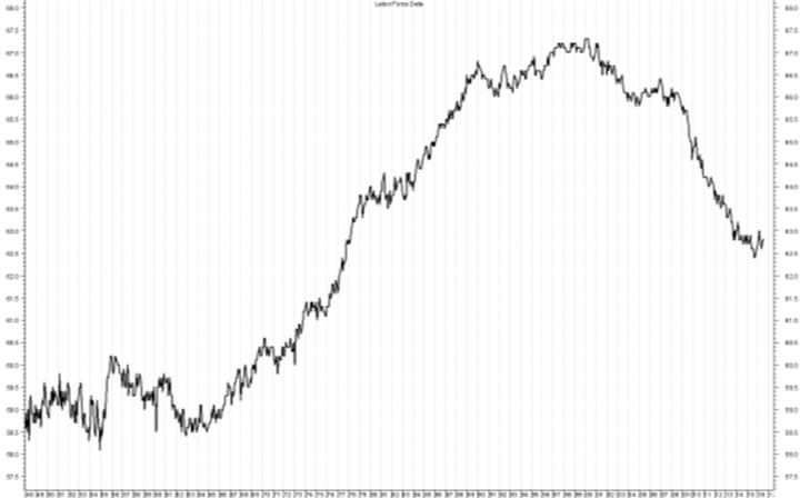
This upturn then peaked in early 2006, ahead of the extended 4-year cycle top in October 2007. Now, look at the upturn that was seen in association with the 2009 4-year cycle low and the collapse that has followed. The latest data available here shows a continued contraction and the lowest levels since the inception of this data in 1959. I don’t care what the economists say, there has been no economic recovery. In fact, it has been just the opposite. This data is depressionary and it clearly shows that the greatest coordinated liquidity campaign in history has failed in this respect. Lastly, I want to also look at the Job Participation Rate, which can be found above.
This chart, as well as the Velocity of Money chart, have appeared in various articles from various sources in the past, but it is when we tie them to volume characteristics of the market and other technical data that the bigger picture begins to come into focus. I want to point out that the JPR peaked in 2000, along with the stock market and the initial contraction of the Velocity of M2. Interesting how that works! This is all related. Here too, note that the liquidity campaign associated with the 2002 to 2007 extended 4-year cycle did positively influence this data in that it finally found a bottom in late 2004 and there was an upturn into late 2006. It is also interesting to note here that the peak in late 2006 was followed by the April 2006 peak in the Velocity of Money. Makes sense doesn’t it? But, now look at what has happened in conjunction with the extended 4-year cycle advance out of the 2009 low. It has collapsed, which is consistent with the Velocity of M2 chart and the price/volume characteristics.
I have several points to make in regard to the review of these charts. One, the evidence clearly suggests that the secular bull market and the economy peaked in 2000. Secondly, it has been the deflationary forces surrounding these secular tops back in 2000 that the Money Masters have been fighting ever since. Third, and perhaps even more importantly, these charts show that the monetary policies in association with the most extended two 4-year cycles in the history of the US stock market has not had a positive impact on the most basic underlying technical conditions of the market or the economy itself. Four, while the current 4-year cycle is more extended than the cycle into the 2007 top, these manipulative efforts have actually been even less affective on the underlying economy than they were in conjunction with the advance into 2007. So, in this respect, there has not only been a diminishing return, but these policies have outright failed with regard to the underlying economy. These efforts have not affected the price/volume characteristics of the stock market what so ever and they have now made matters even worse in that they have left the equity markets in a massive and unsustainable bubble. In short, it has all gone to equities, which has served as camouflage for the underlying economy. I said all throughout the extended advance into the 2007 top that the reinflation efforts were only making matters worse, which it did. I have maintained that the efforts to extend this advance are not only making matters worse, but this time I think far worse than the extension of the previous cycle that led to the 2007 top.
Ever since this advance began trying to peak in 2015, I have said that this is THE Most Dangerous Stock Market Environment since the inception of the averages in 1896 and I still believe that. It has all been a Grand Illusion and the market has served as camouflage for the continued rottening of the underlying economy. The ongoing evidence that we are in a massive topping process is telling us that the global monetary policies are now failing with respect to the markets. No amount of twisting or manipulating of any other data changes or negates this data. Bottom line, there has been no economic recovery. Like the extended advance into the 2007 4-year cycle top, this entire advance has been a manufacture event within the context of a secular bear market and this time the bubble is even bigger and while most don’t see it, this is one very large and very ugly top. The consequences of this extended advance is going to come with an extremely heavy price. Just as my methods gave me accurate statistical price projections for the 2002 and the 2009 lows, these same methods are providing me with projections for the pending unwinding, which even I admit is almost unimaginable. Add to this the current social and political environment and we have a disaster in the making. All the while, the sideways action seen in the market over the last several months has generated maximum complacency. Please, don’t be fooled. More in depth analysis is available in the research letters at https://cyclesman.com
By Tim Wood
Cyclesman.com
© 2015 Cycles News & Views; All Rights Reserved
Tim Wood specialises in Dow Theory and Cycles Analysis - Should you be interested in analysis that provides intermediate-term turn points utilizing the Cycle Turn Indicator as well as coverage on the Dow theory, other price quantification methods and all the statistical data surrounding the 4-year cycle, then please visit www.cyclesman.com for more details. A subscription includes access to the monthly issues of Cycles News & Views covering the stock market, the dollar, bonds and gold. I also cover other areas of interest at important turn points such as gasoline, oil, silver, the XAU and recently I have even covered corn. I also provide updates 3 times a week plus additional weekend updates on the Cycle Turn Indicator on most all areas of concern. I also give specific expectations for turn points of the short, intermediate and longer-term cycles based on historical quantification.
Tim Wood Archive |
© 2005-2022 http://www.MarketOracle.co.uk - The Market Oracle is a FREE Daily Financial Markets Analysis & Forecasting online publication.