


US Dollar Chartathon
Currencies / US Dollar Jan 30, 2017 - 05:37 PM GMT

 In this Weekend Report I'm going to show you some updated charts on the US dollar which has been in a bull market since the low in 2011. It's hard for a lot of investors to admit, but until the charts change the bull market continues. A bull market is characterized by a series of consolidation patterns forming one top of the next, until the last pattern is a reversal pattern which reverses the bull trend. The old expression, the trend is your friend, also applies to the US dollar as well. Until the US dollar negates the series of higher highs and higher lows on an intermediate term basis, we have to assume the bull market is in tact.
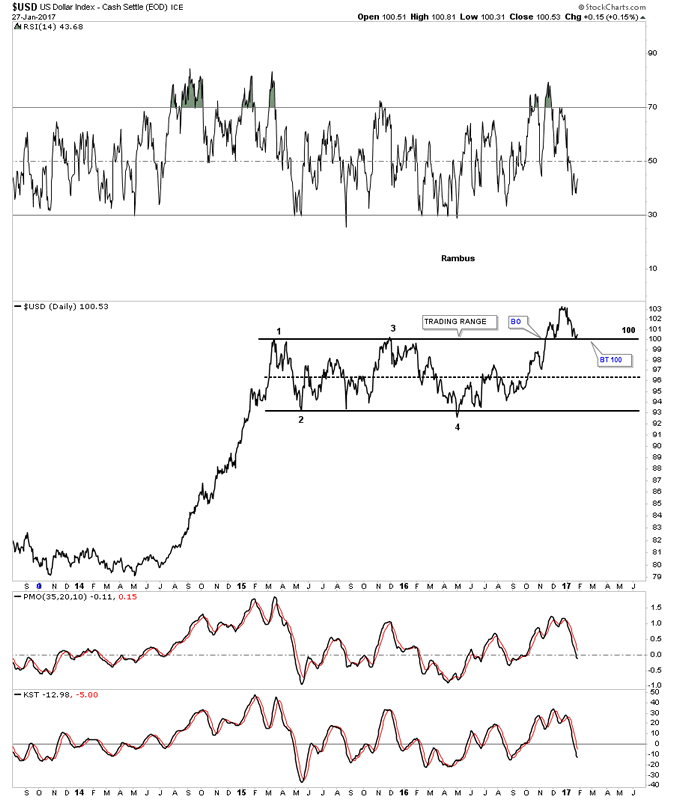
Lets start by looking at a daily line chart for the US dollar which shows the horizontal trading range beginning back in March of 2015. The breakout topside of the horizontal trading range took place a little over 2 months ago in November of last year. After the initial breakout there was the initial backtest which could have been the beginning of the next impulse move up, but the US dollar stalled out a month later and is currently backtesting the top rail around the 100 area again.
This is getting a lot of investors bearish on the US dollar, but nothing is broken yet. So far the top rail of the rectangle consolidation pattern is still holding support and until it's broken this is still just a backtest before the next impulse move up begins in earnest. It's all about playing the odds.
US Dollar Index Daily Chart
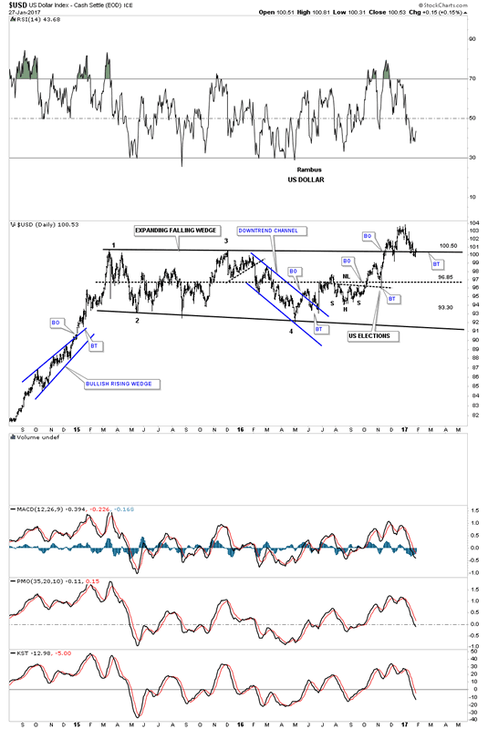
Below is a daily bar chart for the US dollar which shows the price action backtesting the top rail of the sideways trading range. Last Friday the US dollar closed right on the top rail. A worst case bullish scenario for the US dollar would be if the price action declined down to the center dashed mid line, that can happen in sideways trading ranges before the move you were looking for finally takes place. A close below the center dashed mid line would negate the bullish breakout that is currently underway.
US Dollar Index Daily Chart 2
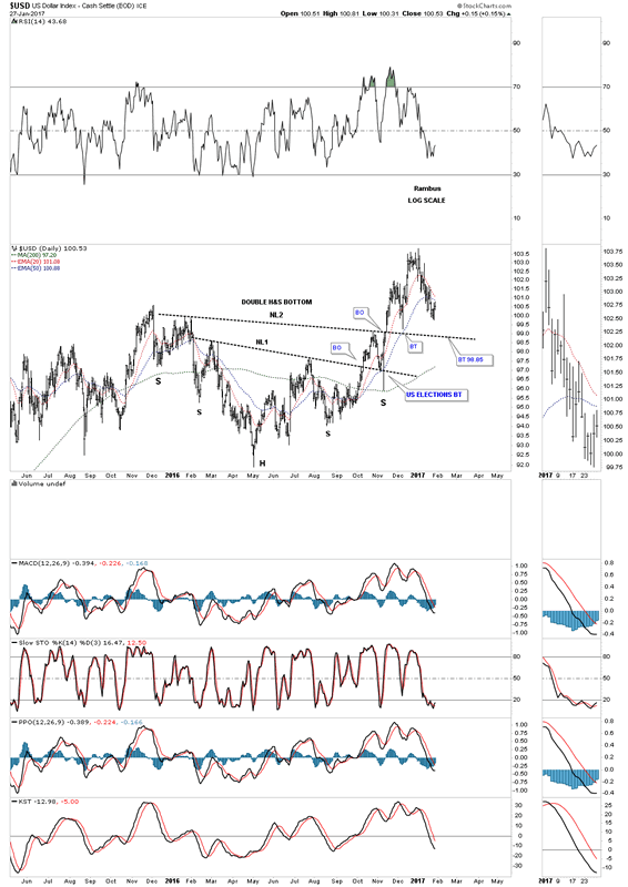
There is another consolidation pattern that has formed during the last year of trading inside the horizontal trading range which is a double H&S bottom. Neckline #1 was broken to the upside in October of last year with the backtest to the neckline being the US election spike. From that backtest the US dollar rallied strongly and broke out above neckline #2, which was also backtested from above with the 50 day ema giving support at the neckline. Neckline #2 support now comes in at the 98.85 area.
US Dollar Index Daily Chart 3
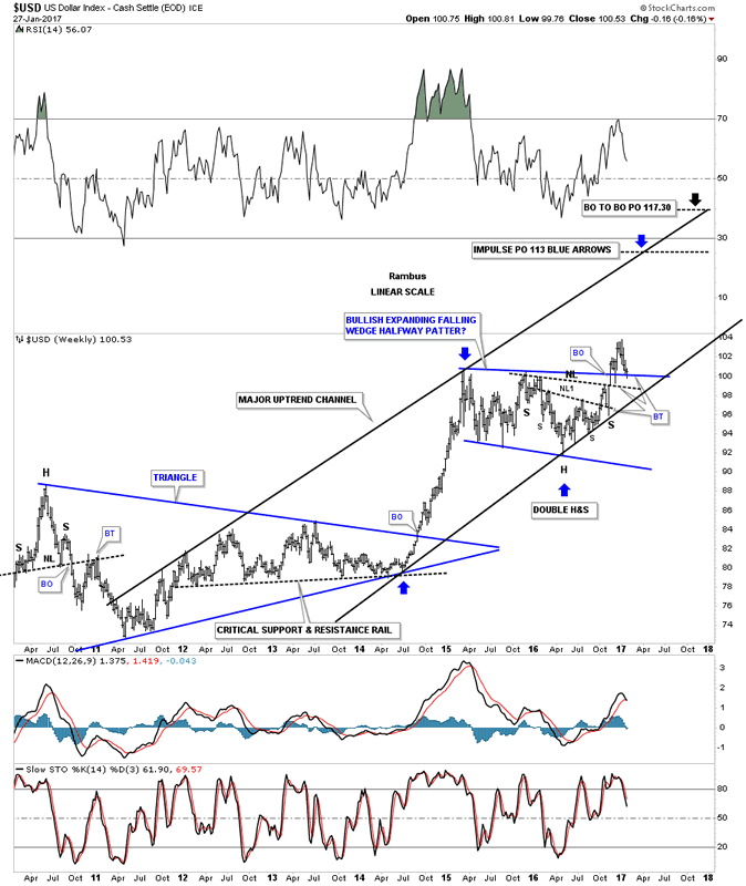
This next chart is a weekly look which puts our year and a half horizontal trading range in perspective. In a bull market there is an impulse leg up followed by a consolidation pattern that leads to the next impulse leg up, so on and so fourth, until the bull market exhausts itself and a reversal pattern builds out.
There are 3 important trendlines which should offer support. The first one is the top rail of the blue trading range which is now being tested. The second important trendline is neckline #2. If neckline #2 fails, then the last bit of support will come in at the bottom rail of the major uptrend channel.
US Dollar Index Weekly Chart
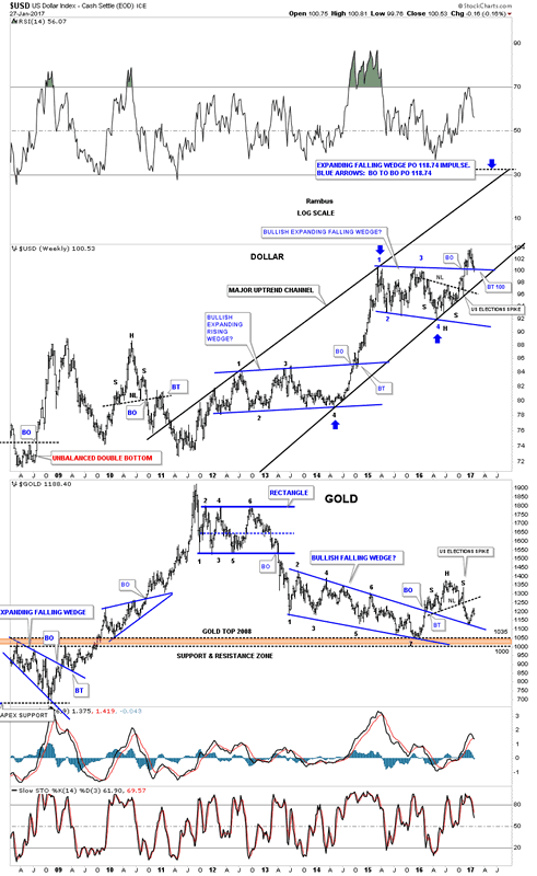
This next chart is a weekly combo chart which has the US dollar on top and gold on the bottom. On the right hand side of this combo chart you can see the 2 H&S patterns that formed on both the US dollar on top, and gold on the bottom, that have formed inversely to each other complete with the US elections spikes. There is also a short term inverse correlation taking place at the December 2016 low on gold that corresponds with the high made on the US dollar, which has now fallen back to the top of the trading range. The bottom line is,, whatever direction the US dollar goes, gold will most likely go in the opposite direction until proven otherwise.
US Dollar Index Weekly Chart 2
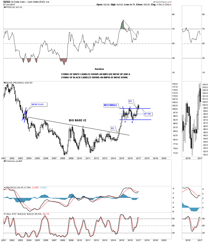
This next chart for the US dollar is a long term monthly look which shows a massive 10 year base which launched the US dollar's bull market. From a Chartology perspective the bigger the base the bigger the bull market. I would expect that at a bare minimum we should see at least one more impulse leg up before the bull market exhausts itself, with the possibility of several more consolidation patterns forming before the bull market ends.
US Dollar Index Monthly Chart
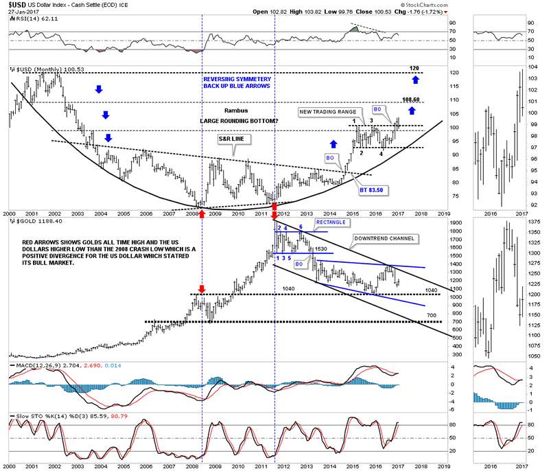
Below is another combo chart which has the US dollar on top and gold on the bottom. The most important aspect of this chart is shown by the two sets of red arrows. The red arrows on the left side of the chart shows where the US dollar bottomed out in 2008 and gold topped out just before the crash. The two red arrows in the center of the chart shows the positive divergence the US dollar had to gold in 2011. Note that massive rally gold had out of the 2008 crash low which led to the bull market peak at 1920 in 2011. While gold was going parabolic the US dollar should have been declining in a significant way taking out the 2008 low, but it didn't. As you can see the US dollar actually made a higher low vs the 2008 low, creating the positive divergence for the US dollar to gold. That is the point where I mark the beginning of the US dollar's bull market. Since that 2011 low the US dollar has been in a bull market while gold has been in a bear market.
US Dollar Index and Gold Monthly Charts
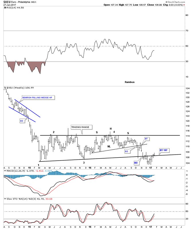
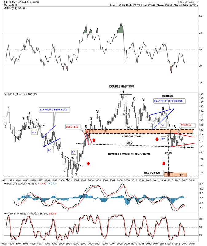
Now lets look at a couple of charts for the XEU. If the US dollar is backtesting an important trendline then the odds are high that the euro is also backtesting an important trendline. Note the H&S top that formed within the sideways trading range that matches the inverse H&S bottom on the US dollar chart we looked at earlier.
Euro Weekly Chart
This long term monthly chart for the XEU shows a massive H&S top in place. The impulse move down out of the blue bearish rising wedge is the same impulse move up in the US dollar, which started in 2014. After slicing through the brown shaded support and resistance zone the euro began to consolidate that big move down by building out the red triangle consolidation pattern just below the S&R zone. If the next impulse move down takes hold, there is a good chance that we will see a move similar to the one when the price action broke below the blue bearish rising wedge, right shoulder.
Euro Monthly Chart
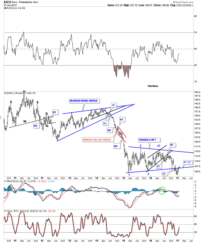
The weekly chart for the XEU shows a close up view of the 2014 impulse move down and the current blue triangle consolidation pattern building out. I have been looking for a backtest to the bottom rail to come in around the 107 area, which was hit this past week.
XEU Weekly Chart
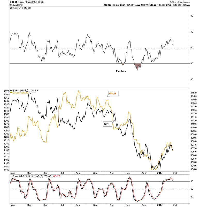
The last chart for the XEU shows why we need to pay attention to what this currency does as gold tends to trade in tandem. It's not a perfect correlation but close enough.
XEU and Gold Daily Charts
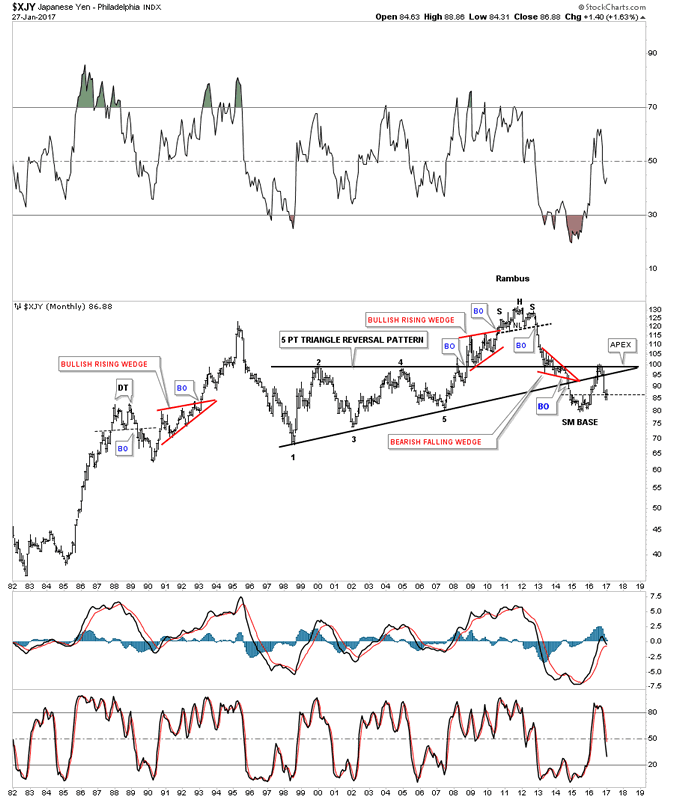
The XJY, Japanese yen, is another important currency to follow if you want to know what the PM complex is up to. In 2011 the yen built out a H&S top about the same time gold topped out. Just like gold, the yen has also been in a bear market, forming a small base in 2015, which gave the yen its first counter trend rally. This counter trend rally took the price action back up to the top rail of the black 5 point triangle pattern which now became the apex. The apex of a triangle is where all the energy is located between the bulls and the bears. Normally they will hold support or resistance depending on the direction of the move. If the apex of a triangle fails to hold support or resistance then you have an end around move, which can be bullish if the move is up, or bearish if the move is down. This chart shows the apex holding resistance.
Japanese Yen Monthly Chart
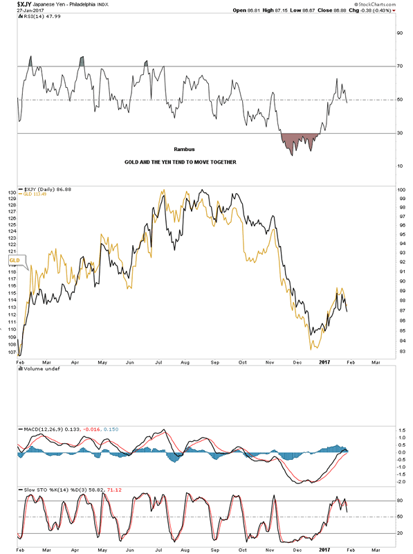
This next chart I overlaid GLD on top of the XJY which shows it has an even closer correlation than gold and the XEU. So how the yen moves, so will GLD.
Japanese Yen and Gold Daily Charts
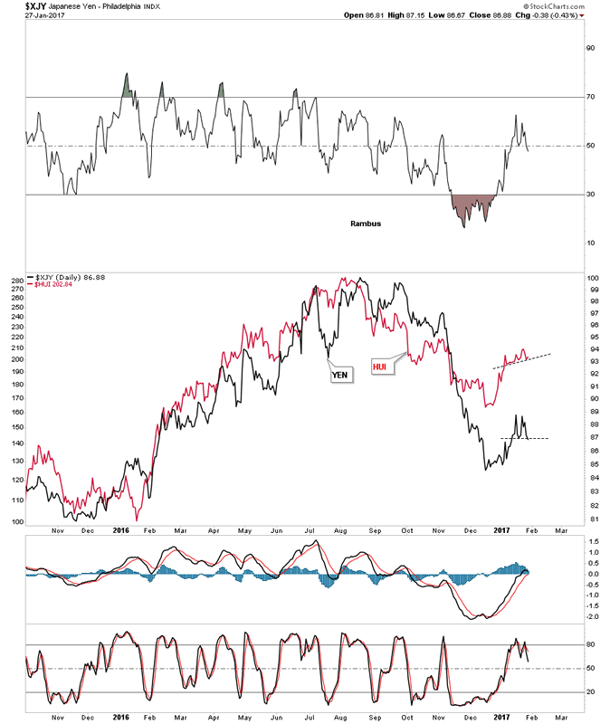
This last chart for the yen I overlaid the HUI on top so you can see the correlation which is pretty strong. You can see there is some interesting price action on the right hand side of the chart as shown by the thin black dashed trendlines. If the yen bounces then the HUI should bounce too. If the yen puts in a double top then there is a good chance the HUI will breakdown below its dashed trendline. It looks like this week is going to be very interesting in regards to these two.
Japanese Yen and HUI Gold Bugs Index Daily Charts
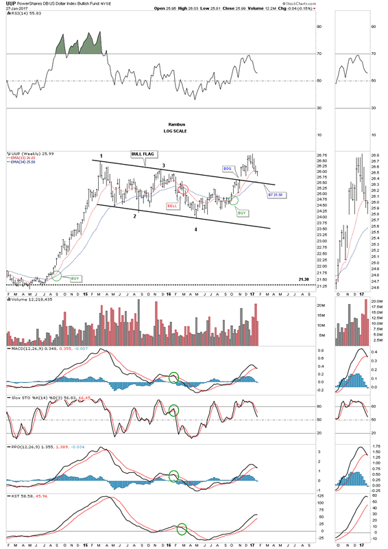
The UUP is a proxy for the US dollar which shows its trading range was a black bull flag. A backtest to the top rail would come in around the 25.50 area where the 34 week ema would also come into play.
US Dollar Index Bulish Fund Weekly Chart
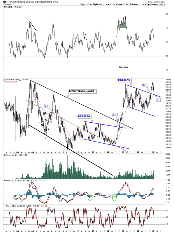
The 10 year weekly chart for the UUP shows its entire history. Note the year and a half blue bullish falling flag that formed at the end of the major downtrend channel which gave the UUP the energy it needed to finally take out that top rail of the downtrend channel. After breaking out of that major downtrend channel the UUP has been consolidating in another blue flag which broke out late last year, and is deciding if it wants to do a complete backtest to the top rail and the 30 week ema.
US Dollar Index Bulish Fund Weekly Chart 2
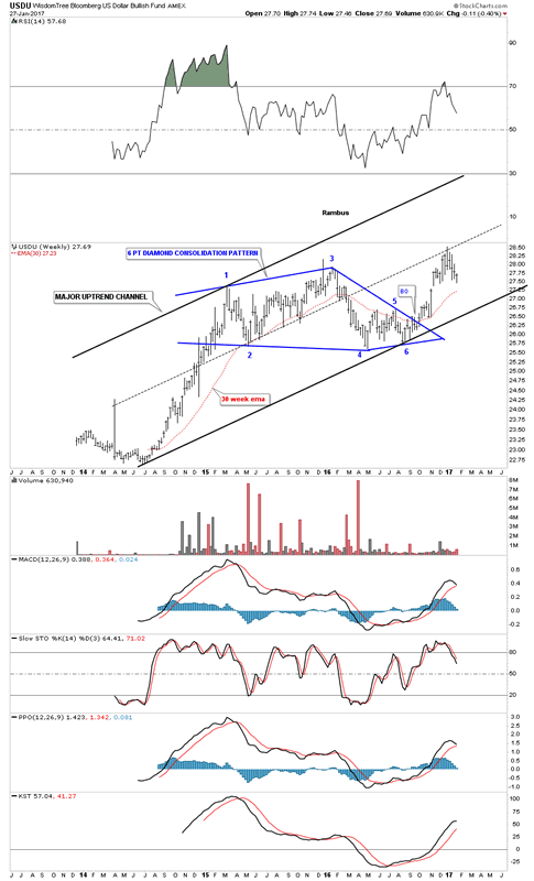
This last chart for tonight is a weekly look at the USDU which has a more equal weighting for the US dollar. We've been following the breakout from the blue diamond for three months or longer which is still in play. The 30 week ema does a good job of showing you where support and resistance lies.
The bottom line is, how the US dollar trades will have a direct impact on currencies and the PM complex. They can move together for short periods of time, but in the long run they tend to move inversely to each other. The US dollar is doing a critical backtest that is going to give us some important clues by how it interacts with the top rail of its nearly 2 year trading range. If the US dollar fails to follow through to the upside then the PM complex will enjoy another very strong bull market. Right now the US dollar is at an inflection point in regards to the big picture, which will come to an end at some point. All the best...Rambus
Wisdom Tree Bloomberg US Dollar Bullish Fund Weekly Chart
All the best
Gary (for Rambus Chartology)
FREE TRIAL - http://rambus1.com/?page_id=10
© 2017 Copyright Rambus- All Rights Reserved
Disclaimer: The above is a matter of opinion provided for general information purposes only and is not intended as investment advice. Information and analysis above are derived from sources and utilising methods believed to be reliable, but we cannot accept responsibility for any losses you may incur as a result of this analysis. Individuals should consult with their personal financial advisors.
© 2005-2022 http://www.MarketOracle.co.uk - The Market Oracle is a FREE Daily Financial Markets Analysis & Forecasting online publication.