The Demise of the Gold and Silver Bull Run is Greatly Exaggerated
Commodities / Gold and Silver Stocks 2017 Mar 21, 2017 - 03:16 PM GMTBy: Peter_Degraaf
 A few analysts are once again beating the drums for much lower gold and silver prices - supposedly just around the corner. They mistake the testing of a recent breakout for a turnaround in the main trend. In the process they are sowing confusion. Here are some charts that show the main trend, along with reasons why the price of gold and silver is on track for a sharp rise, thanks to bullish fundamentals.
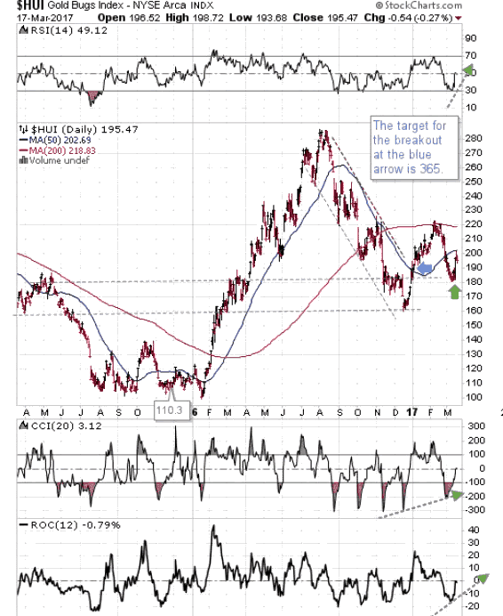
In view of the fact that we expect mining stocks to lead the way, we will start with the HUI index of gold miners. Price has just finished a test of the January 2017 breakout. The green arrow points to confirmation of the uptrend that began at the blue arrow. This is referred to as an "ABC bottom". The target for this breakout is 365. The supporting indicators are positive with room on the upside.
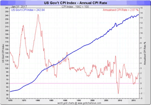
This chart courtesy Goldchartsrus.com shows the long-term trend in the US rate of inflation, along with the short-term trend in red. Both long-term and short-term rates are rising. This trend provides energy for gold and silver to rise.
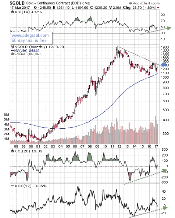
Featured is the long-term gold chart in log format. Price has found support at the 150 month moving average. A breakout at the $1300 level will be very bullish and will set up a target at $2100.
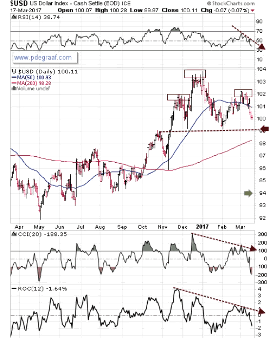
Featured is the US dollar index. Price appears to be carving out a 'head and shoulders' pattern. The set-up will be confirmed in the event of a breakdown at the purple arrow. The target for this potential breakdown is at the green arrow. Gold and silver can be expected to benefit in the event. The supporting indicators are negative.
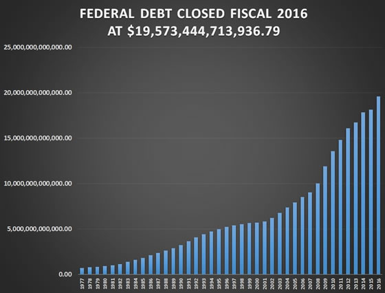
This chart shows the official US Federal Debt is closing in on 20 trillion dollars. It will never be repaid. It will be inflated away. Gold and silver will rise in price as a result, albeit in inflated currency.
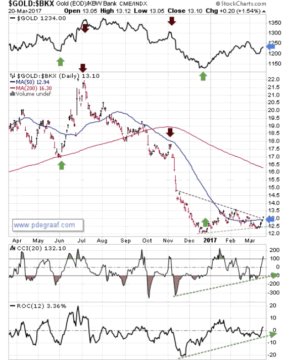
Featured is a chart that compares gold to the US banking index, with gold again at the top. Major turning points in this comparison chart usually coincide with turning points in gold, as indicated by the vertical green and purple arrows. The breakout at the blue arrow, once it is confirmed by a rise above Monday's range, is likely to lead to a surge in the price of gold.
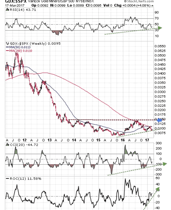
Featured is a chart that compares GDX (the miners ETF), to the S&P 500 index. The pattern is an Advancing Right Angled Triangle (ARAT). The supporting indicators are positive. A breakout at the blue arrow will be very bullish for gold and mining stocks, and bearish for generic stocks.
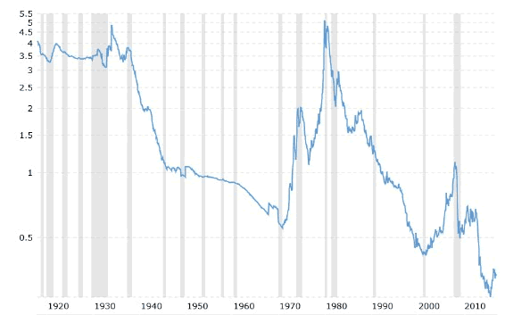
This chart courtesy www.macrotrends.net is one of our most popular charts. It features the gold price compared to the US Monetary Base. The current ratio of 0.3 is just above the lowest reading in 100 years! This means gold is the cheapest in 100 years! The time to buy gold is when it is cheap in comparison to the Monetary Base (as now), and the time to sell is when the ratio rises above 3.5, as it did in 1980.
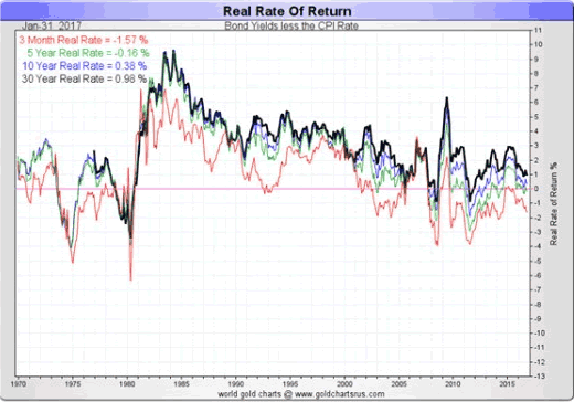
This chart courtesy Goldchartsrus.com shows the 'real rate of inflation'. When the rate is below zero and falling (as now), we expect gold to rise in price, based on historical performance.
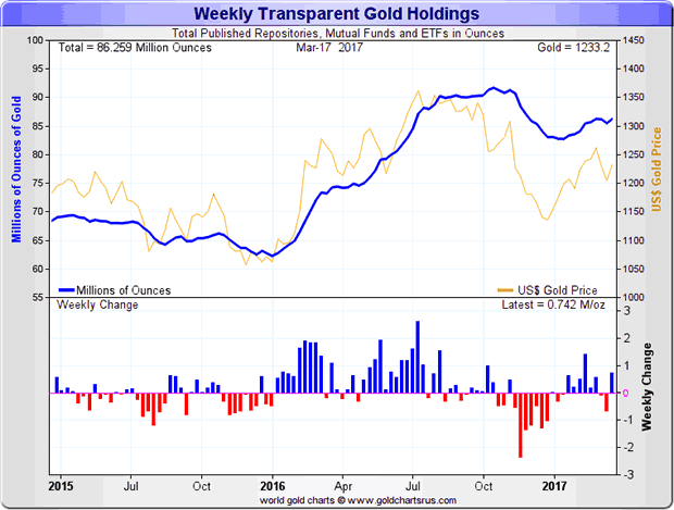
This chart courtesy Goldchartsrus.com shows gold holdings in trusts and ETFs are on the rise again.
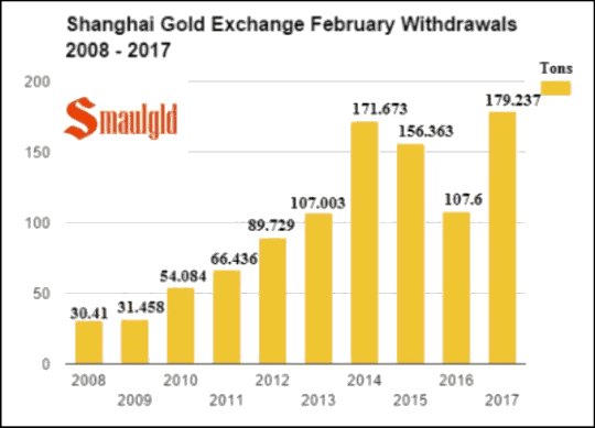
This chart courtesy Smaulgld.com shows a major contributor to the current bullish fundamentals in gold. Chinese investors and jewelers purchased 179 tonnes of gold at the SGE in February. This was the highest number for any February on record! This amounts to well over half of all the gold that was mined during the month of February.
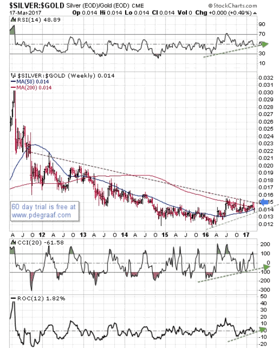
Featured is the index that compares silver to gold. For the past year silver has outperformed gold. A breakout at the blue arrow will cause the trend to pick up momentum. It will be bullish for gold but even more bullish for silver. The 50 week moving average is about to perform a 'bullish crossover'.
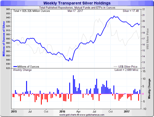
This chart courtesy Goldchartsrus.com shows holdings of silver bullion at trusts and ETFs is rising again, after a four month decline.
Peter Degraaf is NOT responsible for your trading decisions. Please do your own due diligence.
By Peter Degraaf
Peter Degraaf is an on-line stock trader with over 50 years of investing experience. He issues a weekend report on the markets for his many subscribers. For a sample issue send him an E-mail at itiswell@cogeco.net , or visit his website at www.pdegraaf.com where you will find many long-term charts, as well as an interesting collection of Worthwhile Quotes that make for fascinating reading.
© 2017 Copyright Peter Degraaf - All Rights Reserved
DISCLAIMER:Please do your own due diligence. Investing involves taking risks. I am not responsible for your investment decisions.
Peter Degraaf Archive |
© 2005-2022 http://www.MarketOracle.co.uk - The Market Oracle is a FREE Daily Financial Markets Analysis & Forecasting online publication.


