History of the Post WWII Crude Oil Price From a Technical Perspective
Commodities / Crude Oil Apr 17, 2017 - 10:42 AM GMTBy: Plunger
 This is part I of a 3-part series introducing Plunger's "Trade of the Year". This section gives a review of the oil price from 1946 to present explaining the essential forces which powered its price through various bull and bear markets. It explains how we ended up where we are today in the oil market. Part II will explore the macro forces driving today's economy which lays the groundwork for introducing my trade of the year in part III.
To acquire a broader view of oils path over the past century I highly recommend the following resources on the oil market. Daniel Yergin's "The Prize" is an in-depth review of the history of oil up to the First Gulf war. It is indispensable in understanding the growth of the industry. Other books provide entertaining color to the industry by reviewing the swashbuckling nature of the early players who formed the industry as independents. I recommend "The Big Rich" by Bryan Burrough and JP Getty's autobiography "The Way I See It". Finally, David Stockman's "The Great Deformation" is essential reading as it corrects all the false economic narratives of the past which have been masquerading as truth.
Boom and Bust
That's the essential nature of the history of oil over the past 140 years. It tends to be that way for most of the commodity sector is because the cycle of production leads to it. Commodity bull markets typically last about 10 years. That is about the amount of time required for the supply/demand process to go full circle. Initially inadequate supply leads to a price response which over time brings forth investment and exploration. At first conventional bank financing is hesitant to fund the sector since it is out of favor. This delays the formation of investment, but venture capital fills the void. Eventually the ensuing development brings forth supply and the prevailing narrative wakes up and recognizes the bull market. Conventional financing then funds the industry bringing forth development on a grander scale. Since this is a time consuming process supply is slow to keep up with demand thus price continues to become elevated (bull market). Elevated price calls out substitution of other energy sources (ethanol, nuclear, natgas, LNG,wind, solar, fracking). Over time development brings forth much greater supply with the discovery of new oil basins, (North Sea, Prudhoe Bay, Bakken, Eagle Ford, etc) and new supply eventually overwhelms demand which completes the circle and leads the market into the next phase which manifests itself as a bear market.
We have seen this process over and over since the discovery of oil. This is the nature of the commodity cycle. When we overlay monetary policy onto this cycle it exasperates the depths and length of this natural cycle leading to euphoric bull markets and crushing bear markets.
Explosion in Demand
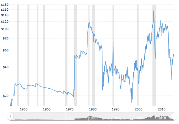
World energy consumption quadrupled between 1945 and 1972, with oil demand increasing by more than six times. World wide economic growth and the rise of the middle class led to staggering demand for oil products. The amazing thing from a current day perspective is that despite this growth in demand the price of oil was relatively stable. In the two charts below we see the nominal price appearing to virtually flat line from 1949-1972 while the real price (CPI adjusted) actually was cut by 1/3 over this period.
Nominal Oil price 1948-2016
Inflatopn Adjusted Oil Price 1948-2016
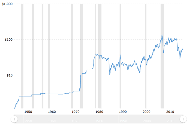
Note the first chart shows the real price of oil actually decreasing through out the decade of the 1960's while the second chart shows oils nominal price increasing moderately from 1949-1973.
Bretton Woods - Postwar golden age and the fuel for monetary chaos.
"Inflation is always and everywhere a monetary phenomenon"- Milton Friedman.
To understand the oil market and price from 1946-1980, It is essential to understand the monetary backdrop of that era. The Bretton Woods monetary regime defines the grand movements of the oil price over this period. This agreement set up the post WWII monetary system which lasted until August 15 1971. It established the USD as the center of the world's monetary system. Exchange rates were pegged to gold since foreign governments could exchange their accumulated dollars for gold from the US treasury. This anchored currencies to the USD and the USD was anchored to gold. It provided a stable monetary system and enforced financial discipline by limiting the expansionist policies of government to their ability to tax its citizens.
In the early years it served the West well, however by the early 1960's the golden era of FED/Eisenhower financial discipline was over. The USA no longer desired this discipline and began to abuse its "exorbitant privilege" by "printing money" (expanding credit). It greatly expanded the money supply well above its taxing powers to pay for its imperial wishes. Social programs and its wars required vast money printing. The Bretton Woods system allowed the increased supply of dollars held by foreign governments, caused by money printing, to be exchanged for gold from the US treasury. These dollars represented debts owed to others by the US government, however the intent was to never pay. This is known of course as theft.
The London Gold Pool
In order to keep this lucrative arraignment of expanding the money supply over and above the creation of real wealth it became necessary to disguise what was really going on. The US after all was supposed to be anchoring the USD to a limited asset, namely gold. Throughout history gold production has only been able to grow at about 1%/year. The USD was being increased many times this rate. Since gold is a monetary asset (not a commodity) its price quickly reflects any monetary debasement occurring by central banks. So in order to keep the game under wraps the monetary powers set out to suppress the price of gold. A rising gold price announces to the world that debasement is ongoing and threatens the game.
So the US formed the London Gold Pool on 1 November 1961 co-opting 7 other central banks to dump gold onto the market to suppress the price. It was intended to maintain the Bretton Woods system of fixed-rate convertible currencies and defend a gold price of $35 through interventions in the London gold market. The US was the ring leader and provided 50% of the gold for operations from its vast post war hoard of 23,000 tonnes. By 1965 the pool was increasing unable to stem the rise in the gold price which reflected the level of debasement. Despite intense diplomatic pressure to limit purchases of gold, the pool found itself trying to hold back the tide.
By 1967 the French were no longer willing engage in a lost cause so they withdrew from the pool and sent a frigate to New York harbor to collect the remaining gold it held in storage at the NY Fed. Soon after in March 1968 the jig was up and the US asked the Bank of England to close the gold market. During the life of the pool the US had squandered the majority of its gold hoard which it had confiscated from its citizenry in 1933 by sending 12,000 tonnes down the rat hole in a retrograde action defending the Dollar through its gold price suppression. Over the next 3 years the US treasury resorted to strong arm tactics to maintain order. They were no longer willing to use any more of its precious gold which served as its bedrock to monetary legitimacy.
Strong arm tactics of course only can hold back the tide for a limited time. On 13 August 1971 the Bank of England requested its $3B of USD holdings be guaranteed against devaluation through conversion to gold. This was the straw that broke the camels back as the remaining US gold position had become too precious. Two days later on Sunday 15 Aug 1971 the US responded with Nixon reneging on his nation's promise to redeem dollars for gold. This act today is euphemistically referred to as "closing the gold window". This of course effectively ended the post WWII monetary regime of Bretton Woods I.
The Oil price pricing in two decades of Monetary debasement.
So why is this monetary backdrop important to understand? It is because ultimately this is the force behind the rise in the oil price throughout the 1970's. The great rise of oil from $2.50/Bbl to $40/Bbl over the course of a decade was principally due to monetary conditions and not due to the supply/demand dynamic. Oil, being a real asset with intrinsic value is related to gold as it shares an element of monetary character. So by the early 1970's the monetary debasement of the last 25 years finally began to be reflected in the price of any real asset with intrinsic value. Agriculture prices exploded as did gold and the entire commodity complex. Oil being the life blood of the industrial west led everything higher.
I was a young college student at this time and I recall going to costume parties where partygoers would dress up as "evil" oil sheiks. , They were proxies for who to blame for the shocking launch in gasoline prices. In the shallow minds of consumers the Arab oil embargo was the cause of these skyrocketing oil prices. Seemingly no-one understood that this event was simply the catalyst for the repricing of a real asset in response to decades of monetary debasement subterfuge.
With this as background let's view from a chart perspective what happened next. In 1974 oil began its run from $2.80/bbl to $40 by the end of the decade. This was such a giant move that it shocked the world. Whenever any market makes this big of a run it has to consolidate its gains. The bigger the gain the longer the consolidation is a good rule and that's exactly what the oil market delivered. As previously mentioned the 10 year bull market drew in massive investment, ultimately leading to gushing new supply. North Sea and Alaska North slope came in. So below we see what this consolidation looked like. The channel depicted can be extended all the way back to 1974 where oil first entered the range and stayed there for 30 YEARS! That's right, the elevated price of the 1970's bull market drew in enough supply to cause an 18 year secular bear market from 1980 to 1998.
Light Crude Oil Quarterly 1984-2009 Chart
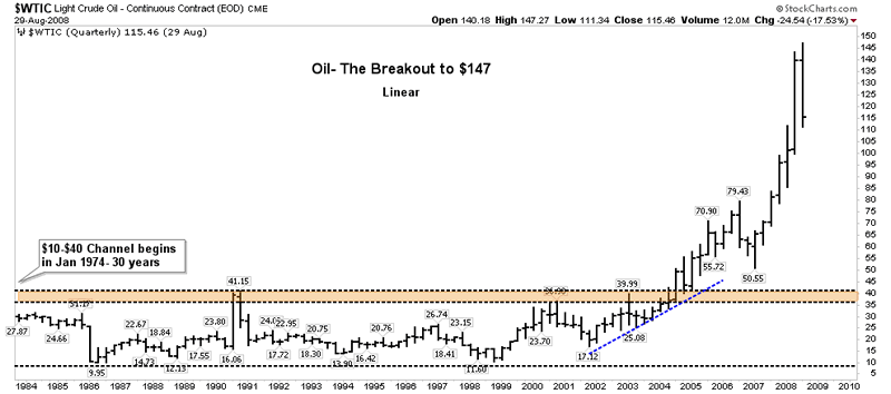
The dynamic of the 1980's was increased supply entering the market. OPEC attempted to maintain elevated prices using its swing producer status to cutt back production. In 1980 Saudi production was 10m bbls/day. As prices fell they continued to support the market price with further cuts. By 1984 they were down to producing 2.5m bbls/day. They soon tired of underwriting marginal producing members and In an effort to regain market share and control of the market they decided to flood the world with oil. Their increased production drove prices down to $10/bbl. This reasserted control of the market, however it had major geopolitical knock on effects that were unanticipated. The Saudi's action led directly to the end of the Soviet communist system. At $10 oil the Russians were unable to hold their vast uneconomic system together and the entire system collapsed by 1991.
By 1998, price finally found its bottom at $11.60 after 18 years. Oil price then embarked in a series of higher highs and higher lows. We call this a bull market. This bull market ultimately lasted 10 years ending in wild mania-driven price action and peaking at $147/bbl. The narrative had progressed from cheap plentiful oil to scarce fear stoked "Peak Oil" . Commodity bull and bear markets give us pure technical chart formations and this 10-year bull market shows this. The chart below amazingly depicts how the ultimate price, despite being an unpredictable mania, was projected by the height of the channel. Ultimately, price reached the same percentage move above the channel as it was bound to within the channel for 30 years. The key takeaway here is that for 30 years price was building cause and coiling energy within the channel. Despite several spikes to the top of the channel the resistance repelled the move higher. The first bounce off of top resistance was the peak in 1980, where everything was dominated by oil. In 1990 we bounced off that same resistance as we went to war against Saddam. Ten years later we bounced off it again in the next encounter in Iraq. Starting in 1998 however, each time price got repelled by resistance it was bought at a higher low. The bull market was now on after 18 long years and when the breakout came above its 30 year resistance the energy it had been coiling over this time provided a massive propellent.
Light Crude Oil Quarterly 1982-2017 Chart
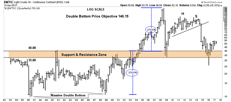
The below chart depicts the 10-year bull from 1998-2008. It shows a clear definition of the three phases of a bull market. The one area of original thought I offer is extending the work of Robert Rhea of Dow Theory fame. Rhea took Hamilton's work and perfected the concept of psychological phases of bull and bear markets. Each has 3 definitive phases. I have extended his work to apply chartology to Rhea's psychological phases. As mentioned, the commodities offer pure chartology and we see it here.
Phase I - The accumulation phase. It is where informed investors establish positions in the early formation of the new bull market. This occurs without the awareness or participation of the general public or the financial institutions. They are acting counter to the prevailing psychology and narrative. The narrative is "its just another BMR". They have been burned so many times before they are no longer willing to "go there". Establishing major positions in this phase is how family fortunes are made. By the way I regard, this act as achievable for savvy students of the market willing to think independently.
Phase II- The mark-up phase. Where rising price action over time gradually attracts attention. This increased awareness leads to increased participation. In time the prevailing narrative comes to recognize a bull market is in force. This of course leads to the fabled point of recognition (POR), which ALWAYS comes in phase II. Phase II is the longest phase and ends when the public fully understands that the market is hot and and they jump in. This leads to a price break or a severe shakeout. However, new supply has still not reached market due to the prolonged period required to finance and bring projects to development.
Phase III - The Mania or Blow-Off phase. This final phase is often relatively short, but it is a sight to behold which will be remembered likely for decades. After the shakeout, the market is bought and the rise ensues. Once the previous high is exceeded all the cats and dogs come out of the woodwork. It's where your Aunt Milda cashes in her heirloom china to free up some cash to "play" the market. Because its a sure thing and the crush is on. Its on the forefront of everyones minds. I recommend reading Edward Chancellor's "Devil take the Hindmost" to see this pattern repeat throughout history.
Finally the last investor throws his last dollar into the market and we reach an exhausted top. The top is now established and the bear market begins. Step yourself through the below chart and see how these phases unfolded. If you were active in the markets during this time reflect on your memories as to the prevailing narrative in each time frame. You will be glad you did.
Light Crude Oil Daily Chart
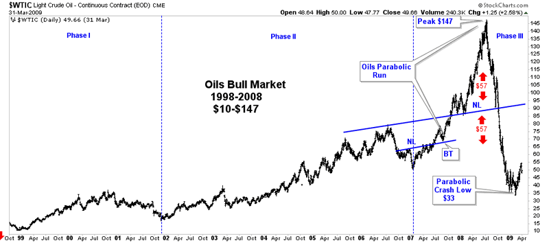
This bull market turned out to be an extreme outlier. Phase III actually resolved itself into a parabola- not good! It's my view this occurred due to two principle reasons. First due to all the pent-up energy we saw released when it broke out of its 30 year channel and importantly due to the monetary ocean of liquidity provided by the FED. We had just finished the tech bubble and were smack in the middle of the housing bubble. Parabola's, as a rule, resolve themselves by crashing down to their base or formation level minus 10%. That's exactly what we got in 2008/9. Again this market followed the rules even though no-one seemed to know the rules.
The Retracement
So here is what we know so far, the bull peaked in parabolic fashion on July 11 2008 putting in a weekly RSI of 77. The previous secular bull market peaked August 1980 with an RSI of the same. This had not occurred since the previous peak. Was this Mr. Market's footprints announcing the great run was now over? In retrospect, indeed it was. The last secular bear lasted 18 years. We are now 10 years since the $147 peak. Could we still be in a secular bear market which began in 2008—-perhaps!
Secular bear markets are defined by cyclical growth below secular trend. They normally entail more than one cyclical bear AND bull market within the context of the secular bear trend. So far we have seen the 2008 crash, (bear mkt) a 26 month retracement (bull mkt) a 5 year move to a new low (bear mkt) and the current move of Feb 2016 to Feb 17 from $26-$55 (bull mkt). So the obvious question is: was the secular low established at $26 in Feb 2016? Are we in a new bull market since then? We will explore this question in part III, remember part I is just a history lesson.
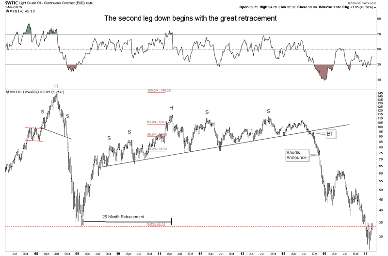
But let's dig deeper into what I refer to as the "great retracement" In retrospect we can see this as just a cyclical bull market retracing the great crash. That looks easy from today's perspective, but recall how everyone was getting lathered up again by the prospects for oil by 2011. Plus the noise wouldn't quit as the elevated price was attracting more investment into the young fracking sector. (Thank you central banks for your easy money policies) Things got wild again and guess what supply got drawn into the sector. This entire 5-year move before the breakdown should be seen as an object lesson of Rhea's psychological phases.
Light Crude Oil Weekly Chart
Psychological Phases in a Bear Market:
To review my essay on the three phases of the Gold Bear market go here: https://goldtadise.com/?p=342331
Phase I – Distribution Phase– Farsighted investors foresee the end of the bull and begin to unload their positions it begins before the top. The pubic remains active and perceives market drops as an opportunity to buy the dip. The market's decline is perceived as simply pull backs within the ongoing uptrend. News headlines continue to be positive validating the existing narrative.
Phase II - Panic and Institutional capitulation phase. Most think panic occurs in the final bottom phase, it may however the majority of the panic occurs at the time of the POR in phase II. It is where the public and the institutions finally "wake-up" and recognize they are in a bear market. They no longer see it as a correction within a bull market. Its a bear market and its in their face!
Phase III - Capitulation phase or distressed selling. I personally like to refer to this as the annihilation phase. It comes after a prolonged period of liquidation. Final hold outs who saved for a rainy day wake-up and discover it's raining.
Viewing the retracement through this lens ask yourself what was the prevailing psychology during this move? Well it certainly was NOT bearish. I propose that despite the devastating crash of 2008/9 when the market bounced up into the great retracement, it exhibited the psychology and price action of distribution and I remind you that distribution comes in Phase I. I hope you can see the chilling implications of this statement. Incidentally this model accommodates the clear POR we saw in November 2014 when the Saudi's announced that they were not going to underwrite the marginal producers of the world and would not cut production. The market clearly experienced a POR, I submit it was THE POR for the secular bear market which had now now entered into Phase II.
Light Crude Oil 2014 Daily Chart
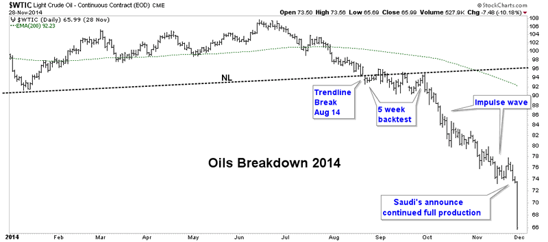
When the market broke its 5-year neck line it put on an extraordinary display of chartology. Below we see an amazing multi week complex backtest. Market price acts as a discovery mechanism and here we have a 5 week exercise of price reacting with the NL. It's action shows that the NL is in fact drawn correctly. It tests from above and it tests from below. After 5 weeks it decides it has had enough and departs on its downward impulse. Price here is discounting the eventual Saudi announcement not to curtail production. Price is now well into phase II of the bear market.
The Phases
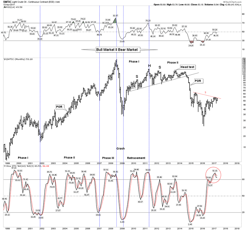
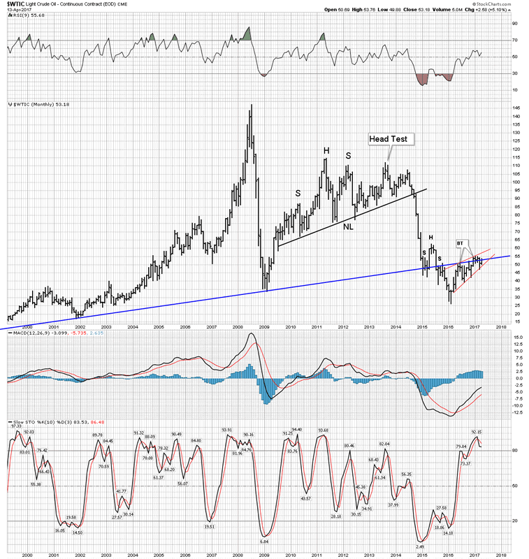
Now we put the phases together in one chart and see how they all fit. Below the 3 bull phases from 1998 to 2008 are clearly depicted. Next is the crash and the 26 month retracement. The market goes on to deceive for 3 more years then all the pent up energy being held back above the NL gets released in a downward impulse driving the price to a new secular low.
Light Crude Oil Monthly Chart
So where to now?
Now we put the phases together in one chart and see how they all fit. Below the 3 bull phases from 1998 to 2008 are clearly depicted. Next is the crash and the 26 month retracement. The market goes on to deceive for 3 more years then all the pent up energy being held back above the NL gets released in a downward impulse driving the price to a new secular low.
Looking at the pattern since the Feb 2016 low we see an obvious inverse H&S developing. Is this the start of a new secular bull market? I emphasize the word "obvious" which of course makes me recall the late Joe Granville's phrase "what is obvious is obviously wrong".
It's starting to get more complicated.
Yes, there are other ways to look at the price action over the past year and see that "obvious" inverse H&S may not be so obvious. The below chart is where we start. Here we see a linear depiction of that bottom formation. Recall Rambus likes to point out the markets tendency to form patterns on both sides of S&R lines. Guess which pattern tends to get the traction? The second one does, plus both patterns displayed are bearish configurations, the first a conventional H&S above the S&R line and a rising (bearish) wedge on the bottom side. So maybe its not as cut and dry or "obvious" as we first thought.
Light Crude Oil Monthly Chart 2
Conclusion
My main premise is monetary policy has been the principle driver of the oil price over the past 70 years. The nature of commodity markets is inherently cyclical and when we impose central bank policies it makes it even more so. The effect of central banks has prolonged bear markets and increased the amplitude of bull markets. CB policy has caused the biggest duration bubble in history and one must ask what will be the knock on effects over time? In the next segment we will explore the macro forces effecting the market cycle and the oil price. Finally, I will propose my trade of the year.
Good Luck,
Plunger
Copyright © 2017 Plunger - All Rights Reserved
All ideas, opinions, and/or forecasts, expressed or implied herein, are for informational purposes only and should not be construed as a recommendation to invest, trade, and/or speculate in the markets. Any investments, trades, and/or speculations made in light of the ideas, opinions, and/or forecasts, expressed or implied herein, are committed at your own risk, financial or otherwise. The information on this site has been prepared without regard to any particular investor’s investment objectives, financial situation, and needs. Accordingly, investors should not act on any information on this site without obtaining specific advice from their financial advisor. Past performance is no guarantee of future results.
© 2005-2022 http://www.MarketOracle.co.uk - The Market Oracle is a FREE Daily Financial Markets Analysis & Forecasting online publication.


