Ratio Combo Charts : Hidden Clues to the Gold Market Puzzle
Commodities / Gold and Silver 2017 Jun 22, 2017 - 05:13 AM GMT Today I would like to update a few ratio combo charts as several are at a crossroad, which may shed some light on where the PM complex may be headed next. A couple of the ratio combo charts worked out extremely well in calling a bottom in January of 2016.
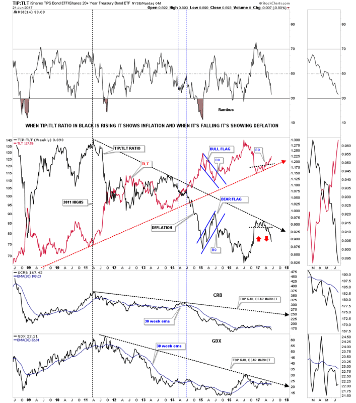
Lets start with the TLT:TIP ratio combo chart we looked at recently which shows if we’re experiencing inflation or deflation. When the ratio in black is falling it’s showing deflation and when it’s rising it’s showing inflation. From the 2011 high the general trend has been for deflation. About a year ago you can see the black ratio was rising in a pretty strong move up, but late last year and the first part of this year the ratio topped out and has begun to fall. The red arrows shows how the ratio is reversing symmetry down over the same area on the way up. For the time being there isn’t much in the way of support.
At the bottom of the chart I added the CRB index and the GDX which also topped out in 2011 and have been trending down with the black ratio. If the TLT:TIP ratio keeps falling, will the CRB and GDX keep performing in a similar manner as they have since their 2011 bear market highs? The 30 week ema is the first line of resistance they will need to overcome followed by the top rail of the 2011 bear market downtrend channel.

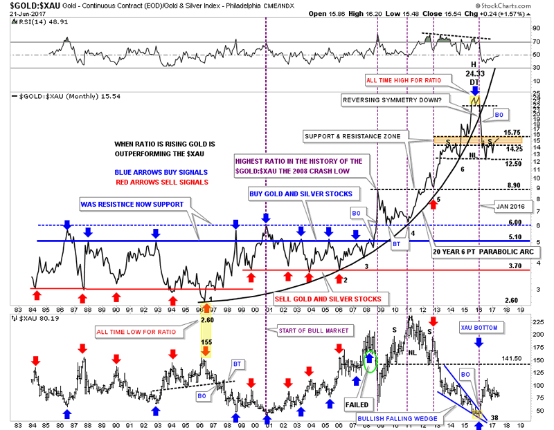
This next ratio combo chart compares gold to the XAU on top with the XAU on the bottom. Long term members are familiar with this chart, but for the new members I’ll give you a quick rundown. For many years when the ratio chart on top would get down to the 3.70 area it was a good time to sell your pm stocks, red arrows, and when the ratio got up to the 5.10 area it was a good time to buy your favorite PM stocks.
All that changed dramatically during the 2008 crash in the PM complex when the ratio made a new all time high above 6.00 for the first time in history. That new high for the ratio above 6.00 told us just how weak the PM stocks were to the price of gold. Little did I know back in 2008 that the under performance of the PM stocks to gold would continue until January of 2016. That little double top in 2016, yellow shaded area, was the first clue that the ratio may be topping out. When the price action broke below the double top hump that was the beginning of the January to August 2016 rally in the XAU. I suggested at the time that the rally could be very strong because the 20 year, 6 point parabolic arc, was finally giving way. Normally when a parabolic move ends you can have a big move equal to or greater than the parabolic move in the opposite direction.
I was initially looking for support at the brown shaded S&R zone, but the ratio declined all the way down to 12.50 before it finally found support. After the ratio bounced at 12.50 I drew in the possible H&S top looking for a right shoulder to form in the brown shaded area. That has happened, but now the ratio is testing the upper limits of the brown shaded S&R zone. The bulls want to see this ratio declining as it suggests that the PM stocks are out performing gold which is what you want to see in a bull market. The XAU chart on the bottom shows how it began its 2016 rally at the exact same time the ratio broke down from the double top.

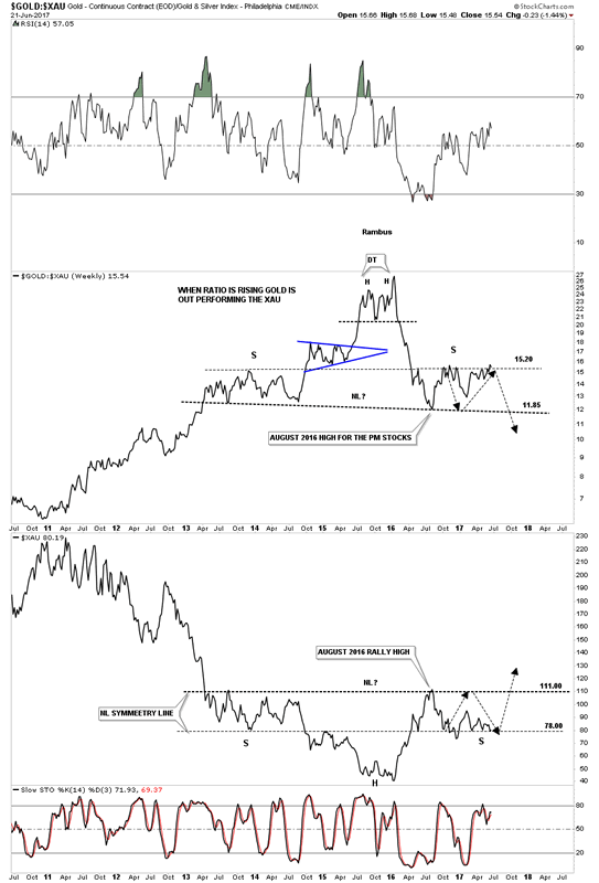
This next ratio combo chart is a weekly line chart which compares gold to the XAU on top with the XAU on the bottom, which gives us a close up view of the possible H&S top on the ratio chart. When I first built these charts the possible right shoulders were still pretty small in relation to the left shoulders so I added the black arrows looking for some symmetry. As you can see, if the H&S patterns are going to play out we need to see the ratio chart on top start to break down as it’s testing the upper limits of the right shoulder, while at the same time we should see the XAU putting in its low for the right shoulder. These potential H&S patterns are 4 1/2 years in the making so if the XAU can take out the neckline there will be a very large base in which to launch a new bull market. On the other hand if we see the ratio rally much higher than where it is now the odds favor a continuation of the bear market.

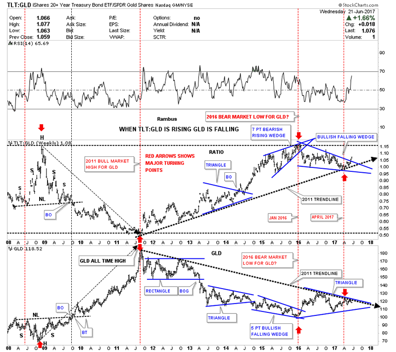
Below is another ratio combo chart which compares TLT to gld on top with gld on the bottom. When the ratio is rising gld is generally falling and vice versa. The ratio has a pretty strong inverse correlation with gold. On the left hand side of the chart you can see the ratio built out a H&S top while gld built out an inverse H&S bottom at the 2008 crash low. Then in 2011 you can see where gold topped out and the ratio bottomed out which was the start of the bear market for gold as shown by the red arrows.
The ratio chart gave us a very clear and early buy signal back in January of 2016. The ratio was building out a rising wedge formation which ended up having 7 reversal points making it a bearish rising wedge. When the price action broke below the bottom rail of the rising wedge a buy signal was given which coincided with the small double top on the Gold to XAU ratio chart we looked at earlier.
Some of you may have already noticed that the ratio chart on top has formed a 15 month falling wedge which has broken out topside while gld on the bottom chart is finding resistance at the top rail of a possible triangle. The heavy black dashed trendlines shows the 2011 bull market in the ratio chart and the bear market in gld. The ratio chart on top is strongly suggesting that the bear market might not be over for gold if the breakout continues to hold. Again it’s time for the PM bulls to step up to the plate and show us they mean business. I would love for nothing better than to see the PM sector in a bull market again.

All the best
Gary (for Rambus Chartology)
FREE TRIAL - http://rambus1.com/?page_id=10
© 2017 Copyright Rambus- All Rights Reserved
Disclaimer: The above is a matter of opinion provided for general information purposes only and is not intended as investment advice. Information and analysis above are derived from sources and utilising methods believed to be reliable, but we cannot accept responsibility for any losses you may incur as a result of this analysis. Individuals should consult with their personal financial advisors.
© 2005-2022 http://www.MarketOracle.co.uk - The Market Oracle is a FREE Daily Financial Markets Analysis & Forecasting online publication.


