3 Lesser-Known Charts Revealing a Massive Stock Market Disconnect
Stock-Markets / Stock Market 2017 Aug 22, 2017 - 05:18 PM GMTBy: John_Mauldin
 What’s a fair price for a share of stock?
In theory, it’s easy to define. The fairest price lies at the intersection of the company’s supply and demand curves. The market price at any given moment reveals exactly where that point is.
The averaged prices of all stocks in an index, appropriately weighted, tell us the same for market benchmarks.
In practice, the calculation is not so simple, because it is human beings who make the decisions—if not themselves, then by telling their computers how to decide. Humans don’t always make rational choices.
As such, the stock market is the scene of a never-ending debate over who is the most rational actor.
Although I’m not perma-anything, today I’ll put on a bear hat and review some of the lesser-known indicators pointing to extreme overvaluations.
Hours of Work Needed to Buy the S&P 500 at Record Highs
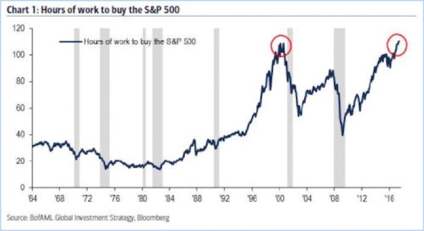
We begin with this Bank of America chart. Look at how many hours the average worker has to work in order to buy a notional share of the S&P 500. Amazing. Kudos to the B of A analyst who worked this data up.

You can see how valuations that are measured in this way skyrocketed in the 1990s bull market, then plunged in the following bear market and recession. They climbed again ahead of the 2008 crash yet could not reach their late-1990s peak. But now they have.
Equity capital is at a historical high (going back to 1964) relative to labor. Two factors could tug the line down to a more normal level: sharply higher wages or sharply lower stock prices.
Of course, I guess prices could go sideways for a few decades as wages rise. But on the probability scale, I put that outcome pretty close to zero.
The Number of Indexes Quadrupled in Just Two Years
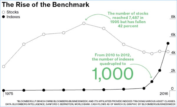
The S&P 500 is just one index, of course. There are many others. In fact, choosing an index is now even harder than choosing a stock is.

The upper line is staggering: Since 1995, the number of listed stocks has fallen 42%? What market force could be causing that? Actually, I can think of several.
The financialization of the markets since 1995 makes it cheaper to buy your competitors than to actually invest in equipment to compete. This has has produced a constant stream of mergers.
This is not creative destruction. It has not resulted in new jobs and greater competition. It is, rather, a result of the central banks of the world messing with the free market and of businessmen optimizing the value of their earnings and cash. When cash is cheap, buy your competitors.
Another clear culprit is regulatory overreach, making it harder for small companies to go public. I am closely aligned with a few private companies. They could easily go public at nine-figure valuations, but the thought of being public companies is simply abhorrent to their management.
When Uber and Airbnb and a host of their fellow unicorns do not go public, something is clearly wrong with the system. Congress should step in and take control of its regulatory creations, but it appears Congress can’t even do the simple stuff like health care and tax reform.
In any case, just in the last year the number of indexes crossed above the number of stocks—and is pointed higher still. The increasing popularity of index-based ETFs is driving this trend, but at some point, momentum has to slow.
But I don’t think that is going to happen soon, because the money that is being made by successful ETFs is such a lure that anybody with the distribution process thinks he or she can do it. Duplicating somebody else’s ETF? Not a problem; it’s all in your distribution chain.
And the market is eating the index ETFs up.
The Number of Upward Trending Stocks Has Plunged
Our next chart comes from my friend, the always-interesting John Hussman.
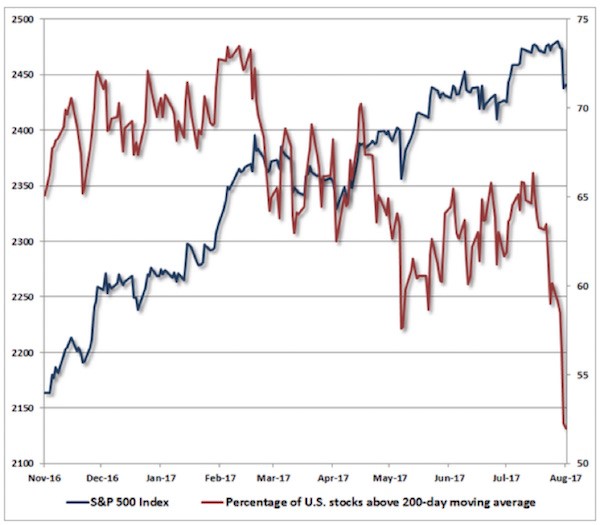
It shows the S&P 500 Index value (left scale) against the percentage of US stocks trading above their 200-day moving average (right scale). Stocks in that category are usually said to be in long-term uptrends.

This chart reveals a major disconnect. Even as the index moves steadily higher, the number of bullishly trending stocks has dropped considerably. On the other hand, it’s still above 50%, so we can’t yet say most stocks are losing momentum.
This trend has brought something to my mind that I wrote about in 2006, when everyone was saying housing prices couldn’t go down. The reality was that every region I looked at had had a bear market in its housing prices, just not at the same time as the rest of the country.
Thus the housing price index for the country looked quite sustainable. But for those of us in Texas, scarred by memories of being able to buy homes at auction on the county courthouse steps in Houston, the concept of falling home prices was very real.
I work closely with managers who “deconstruct” the S&P 500 and invest in various sectors from time to time. Not quite sector rotation but a close cousin. A few years ago, I think everybody realized you didn’t want to be in energy stocks.
But the overall index kept steaming right along.
Join hundreds of thousands of other readers of Thoughts from the Frontline
Sharp macroeconomic analysis, big market calls, and shrewd predictions are all in a week’s work for visionary thinker and acclaimed financial expert John Mauldin. Since 2001, investors have turned to his Thoughts from the Frontline to be informed about what’s really going on in the economy. Join hundreds of thousands of readers, and get it free in your inbox every week.
John Mauldin Archive |
© 2005-2022 http://www.MarketOracle.co.uk - The Market Oracle is a FREE Daily Financial Markets Analysis & Forecasting online publication.


