


QE’s Untold Story: A Chart That Fed Correspondents Need To Investigate
Interest-Rates / Quantitative Easing Nov 01, 2017 - 02:41 PM GMTBy: F_F_Wiley

 We’ve produced some research over the years that we’d love to see the powers-that-be react to, but none more so than our look at financial flows during the QE programs.
By netting all lending by banks and broker-dealers and then comparing it to the Fed’s lending, we stumbled upon a chart that seemed to show exactly what QE does or doesn’t do. But “doesn’t,” not “does,” was the story, and it couldn’t have been clearer. Or shown a more stimulating pattern. To geeks like us, our Excel click on “Insert, Line” was like stepping from a shady trail to a sunny vista.
Here’s the updated chart, which we dubbed the “argyle effect” and looks even sharper than it did when we first produced it in 2014:
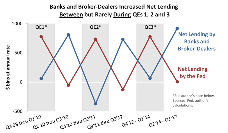
We like the chart because we’re just as confirmation-biased as the average human—anything that confirms our QE skepticism is cognitively satisfying. And the chart appears to show that QE was largely irrelevant. It merely replaced growth in privately financed credit with growth financed by the Fed. The Fed grabbed the credit-growth baton for QE laps and returned it to the private sector for QE pauses, and whoever didn’t have the baton more or less stood still. As we concluded in 2014, QE is a substitution story, not an addition story.
Many pundits told the addition story as QE was underway. They expected banks to “multiply up” reserves by aggressively expanding their loan books. But reserves never significantly multiplied. We think there are five reasons why the “money multiplier theory” failed:
- High-quality borrowers don’t emerge mysteriously from cracks in the Eccles Building and parade zombie-like to bank loan desks. In other words, credit demand was probably about the same with or without QE.
- QE’s effects on bank balance sheets aren’t quite as distorting as they’re often depicted. Consider that new reserves are typically matched by new deposits, because dealers offering bonds to the Fed get paid for those bonds through their accounts at commercial banks. In other words, QE adds a similar item to both sides of bank balance sheets, which you might not appreciate if your information comes from those who call for banks to “lend out” reserves. That’s impossible—reserves can’t be “lent out”—and it often leads to exaggerated statements about the implications of excess reserves.
- To a significant degree, banks can neutralize excess reserves (and the corresponding “excess” deposits) with financial derivatives and other balance sheet adjustments. They can rearrange exposures to mimic a balance sheet of equal risk that’s not stuffed with reserves.
- Just as importantly, excess reserves flow naturally from banks that don’t want them to banks that don’t mind them nearly as much. Consider that Fed data shows a disproportionate amount of QE’s extra reserves landing at U.S. branches of foreign banks. Those foreign banks might have sound reasons for holding excess reserves.
- The money multiplier theory is inconsistent with real-world reserve management practices. The Bank of England has called it “reverse” to how bank lending and reserve management work in the real world. And the gap between theory and reality is so large that you don’t even need the four reasons above to reject the money multiplier—you just need a healthy skepticism about mainstream theory.
According to our chart, even QE’s wealth effects appear to be poorly understood. If credit growth is the same with or without QE, any effects on bond and stock prices might be more psychological than commonly believed. Or, those effects might transmit mainly through financial derivatives (see #3 above). Or, I hear at least a few readers asking, “What wealth effects?” We’ll never know for certain if QE boosted asset prices at all. Maybe the bull market only needed low interest rates, a slowly growing economy, the knowledge that our policy honchos wanted asset prices higher, and a soothing narrative that they have the tools to make that happen?
Think of it this way: New borrowers know approximately how many calories they can consume, and after the Fed starts delivering three meals a day, private banks find that their contributions are no longer needed. By necessity, private banks shut down their kitchens, and almost nothing changes economically. We get substitution, not addition.
Getting to the Bottom of the Burberry Backlash
To be sure, the argyle effect might not be surprising to the Fed’s policy makers. They might have already looked at the data in the same way we did. They might also believe that QE increased the overall lending trend (referring to the entire period’s lending growth), irrespective of the pattern from one QE to the next. All that said, we’d like to know their reaction.
We’d like to know: Would the Fed’s heads explain the chart pattern differently to our interpretation above? If our interpretation is on the central-bank-printed money, how do they justify their policies? How do they expect the pattern to change as QE unwinds? Or, do they not know what to expect—are they as confused as anyone else about what QE really does? The last possibility matches public statements by both current and former FOMC members. (See, for example, Bill Dudley here, Kevin Warsh here, or just about anything from Richard Fisher.)
So, we’re asking Fed correspondents to lend a hand. Nearly nine years after QE began, you’re tired of having the same discussions, right? Here’s a chance to make the discussions more interesting—a chance to drop a Burberry bombshell on your most insightful Fed contact. Inquiring minds would like to see the bomb’s impact, or at least to know how policy makers would go about defusing it. More bluntly, inquiring minds deserve to know. It’s our economy, too, and public officials should be held accountable for the results of their actions.
And if the public interest isn’t enough to persuade Fed correspondents to investigate the argyle effect, we’ll offer other incentives. In return for a report that includes the insights of any FOMC member or senior Fed researcher, we’ll send a complimentary copy of Economics for Independent Thinkers, which is filled with similar research. Or, if our book isn’t mainstream enough for you, we’ll send a thank you with a big smiley face on it. Either way, we look forward to your report on our simple—yet oddly revealing—chart.
Author’s Note: We separated QE and non-QE periods according to the credit the Fed added to the financial system through all of its activities, not just open market operations. Because we included loans, repos, and various emergency facilities enacted during the financial crisis, our time periods are slightly different than the announced start and end dates for QE alone. (For more details, see this note from 2014, although replicators should be aware that the Fed recently replaced its “credit market instruments” category with a few subcategories.) In other words, the line showing the Fed’s net lending is jagged by design. By separating periods of high versus low Fed-sourced credit, we could test whether the private sector’s net lending would show a reverse correlation to the Fed’s activities. As you can see, it did.
F.F. Wiley
F.F. Wiley is a professional name for an experienced asset manager whose work has been included in the CFA program and featured in academic journals and other industry publications. He has advised and managed money for large institutions, sovereigns, wealthy individuals and financial advisors.
© 2017 Copyright F.F. Wiley - All Rights Reserved
Disclaimer: The above is a matter of opinion provided for general information purposes only and is not intended as investment advice. Information and analysis above are derived from sources and utilising methods believed to be reliable, but we cannot accept responsibility for any losses you may incur as a result of this analysis. Individuals should consult with their personal financial advisors.
© 2005-2022 http://www.MarketOracle.co.uk - The Market Oracle is a FREE Daily Financial Markets Analysis & Forecasting online publication.