


Gold’s Upcoming Plunge: The Powerful Analogies, Confirmations and Reasoning
Commodities / Gold & Silver 2019 Mar 05, 2019 - 12:29 PM GMTBy: P_Radomski_CFA

 Gold, silver and mining stocks plunged on Friday and the yellow metal closed the week below the $1,300 barrier. The gold-silver ratio soared once again and it all happened in tune with our expectations, and despite the recent dovish comments from the Fed. And – believe it or not – we have something much more important and exciting about the precious metals sector to tell you today.
Remember the analogy between 2012-2013 decline and the current situation in gold, silver, and mining stocks? We featured it in the previous year and the entire sector appeared to be declining in tune with it. The last few months of 2018, however, along with the initial part of this year, seemed to have entirely invalidated this analogy. But did they?
Over the weekend we dedicated a lot of time to analysis of the long-term charts and as we’re going to show you, it turns out that the analogy between 2012-2013 plunge and the current situation is definitely in place, but we had been earlier in the analogy than we originally thought. What we thought to be a decline similar to the late-2012 slide, was actually the smoothened version of the early-2012 decline. The most recent upswing is just like the mid-2012 upswing. And it seems to have ended.
In the previous months, we had described multiple long-term bearish factors, and the recent few months of higher gold prices were in opposition to them, so something didn’t seem right. We now see what it was. It was the shape of the decline and it’s starting point. Let’s take a look at gold’s very long-term chart for details.
Long-term View of Gold: The Analogies
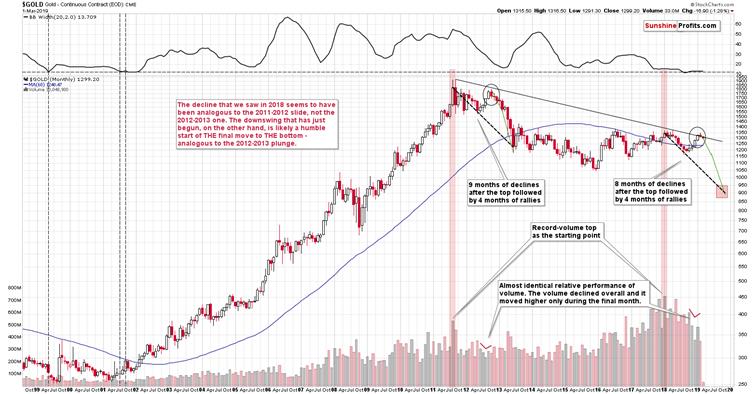
The very first few months of the 2018 were similar to the late-2012 decline, so it was natural to start the analogy with these moves. As we now see, something else fits the analogy better. The record-breaking monthly volume that we saw in 2011 and in 2018 is something that starts an analogy that is confirmed by multiple developments (and not only from gold) and the most recent upswing doesn’t invalidate it. Conversely, it fits and confirms it.
Starting with the record-breaking volume (marked with red rectangles), in 2011 we saw 9 months of declines, and in 2018 we saw 8 months of declines. In both cases, we then saw 4 months of higher prices and then a month where gold moved higher only on an intraday basis, but declined in terms of the monthly closing prices. Both tops formed not too far from the previous high, but still below it. Then gold kept declining for several months.
Quite interesting so far, isn’t it? And we’re just getting started.
The similarity is not only in price. The monthly volume readings are remarkably similar as well. When gold rallied in mid-2012, it did so on declining volume that increased in the final monthly upswing. It was exactly the same case in late 2018 and in January 2019.
What about the shape of the initial decline (late-2011 – early 2012) that was rather chaotic and volatile compared to the stable nature of the mid-2018 slide?
Looking at it with the benefit of hindsight, it’s easy to see why these moves were different. It’s the question of what preceded them. In particular, it’s the question of what kind of volatility was present overall. The former move was preceded by the parabolic upswing in gold prices and the top, while the latter was yet another (boring?) attempt to rally above $1400, which ultimately failed. The volatility that was present at and below the former was very high and the volatility that was present at and below the latter was very low. Consequently, it’s normal and natural to expect that the former decline would be volatile and chaotic, and the latter would be calm. This is normal, not something that breaks the analogy. You can check the volatility levels by looking at the upper part of the above chart – it includes the Bollinger Band width, which can be used as a reliable proxy for volatility.
At this time, the analogy is already quite remarkable, but not yet striking. But, as we explained earlier, we are just getting started.
Enter gold stocks.
Lessons from the Gold Stocks
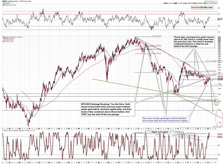
The most important thing about the above chart is that gold stocks have been underperforming gold for months. There were some local and temporary signs of strength, but overall, please note where the HUI Index topped when gold made attempts to rally above $1,400. The 2016, 2017, 2018, and the most recent attempts of gold to move much higher failed at more or less similar levels. There were differences, but they were not huge, and you can see it on the previous chart. Now, where did the HUI Index top on those occasions? At about 280, then at about 220, then at about 210, and finally at about 180. Little difference in gold and the HUI Index is about 100 index points lower. We saw something similar only one time in the recent past – between late 2011 and late 2012. That’s a major confirmation of the grand analogy that we outlined in gold.
But wait, there’s more. There are also detailed confirmations.
We previously wrote that the recent move higher in the mining stocks was similar to what we saw during previous counter-trend rallies that were just pauses in a bigger decline. The bearish implications thereof remain up-to-date, but there’s much more to this upswing than just that.
What exactly happened in early 2012 in gold miners, when gold was moving to its recent lows? Miners broke below their recent lows and declined quite substantially. What happened in mid-2018? Exactly the same thing. We saw a breakdown and a sharp decline. In both cases, the price bottomed and rallied back up only to then decline once again, almost touching the recently formed low. It then reversed and rallied in a sharp manner – again in both: late-2012 and in late 2018.
In both cases the rally continued until miners moved a bit above: the 50-week moving average (marked with blue), the previous lows, and the declining red resistance line. Moreover, in both cases miners topped slightly below their most recent high (the early 2012 high and the mid-2018 highs).
The above makes the analogy remarkable, and there’s still more to come.
In both cases, RSI and Stochastic Oscillator indicators moved from low levels to high levels. In particular, the Stochastic indicator moved from the buy signal to an extremely high values (which had not been seen for many months) before flashing its sell signal.
That was the very start of the carnage. A repeat of the 2012-2013 performance in the HUI Index points to a move below the 80 level. Crazy? It’s based on what had already happened (the size of the decline), so we shouldn’t be surprised to see these levels. In fact, let’s keep in mind that when the HUI Index was topping close to the current price levels in 2015, gold was trading about $100 lower than it’s trading right now. Consequently, unless there is a major shift in the gold miners to gold ratio and the miners start showing substantial strength, gold’s move to just about the 2015 lows is likely to result in a breakdown below the 2015 lows in the mining stocks. Therefore, the implications right now are even more bearish than they were previously. Yes, the chart was extremely bearish, but it seems that it was not bearish enough.
Now, with gold at about $1,050 and gold miners at about 80 or so… What will the miners do if gold slides below $1,000 and bottoms (likely in a very volatile manner) at about $890? The implications are almost unthinkable. We marked a huge area from the 2000 bottom all the way to the 60 level. Yes, it is possible that gold miners would reach it based on what we wrote above, and – if – the analogy to the 2012-2013 is upheld.
Usually while discussing very distant and bearish gold price predictions, we receive messages in which we read that gold price cannot go below its cost of production. Overwhelming majority of the gold ever mined remains on the ground and accounted for. Gold is not consumed as a regular commodity and we can’t base its price discovery on the supply and demand dynamics. Consequently, we would like to – right away – explain that this is not how things work with regard to gold’s production cost. Quoting the key part of our explanation in the Dictionary section:
Some analysts claim that gold production costs constitute the floor for the gold prices. They are wrong. Gold is not like other commodities which are burned or eaten. If their prices plunged below the costs, production collapses. The falling supply and rising demand (due to low prices) help the prices to recover. But that mechanism does not work with gold, as the yellow metal is not burned or eaten. It is hoarded. So when the production falls, the supply of gold does not disappear. Remember that there are massive above-ground holdings of gold. Their presence implies that the link between the production costs and prices is rather weak.
If at all, it is reversed: gold production costs follow the prices. When the price of the yellow metal increases, mining companies will invest in more sophisticated methods to extract gold and will start to operate deeper mines or lower quality ores, boosting the production costs.
And you know what? It’s still not everything that confirms the analogy between now and the 2012-2013 decline.
Enter silver.
Silver Confirms
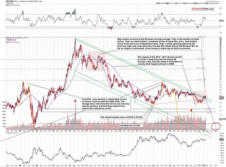
The link starts with the big-volume reversal where silver failed to break above the 50-week moving average (marked with blue). That took place in early 2012 and in mid-2018.
Then silver declined in a quite regular way and bottomed in a very specific way. There was an initial bottom that was followed by a comeback more or less to the 10-week moving average and then the final bottom close to the first bottom. In 2012, this important support was provided by the late 2011 lows, and in 2018, the support was provided by the 2015 lows.
Silver bottomed, and on both occasions, it moved higher in a rather weak manner initially, only to catch up with vengeance later on. It completed the rally after breaking above its 50-week moving average and it topped approximately when the 10-week moving average broke above the 50-week moving average. Such situation in the moving averages is called the golden cross and the above is yet another example of why this (supposedly bullish) technique is rather useless in case of the precious metals market.
What may be concerning is that silver formed a triple top in 2012 and early 2013 before plunging, so if the analogy is to continue, then should we expect another two tops?
No, because we have already seen them.
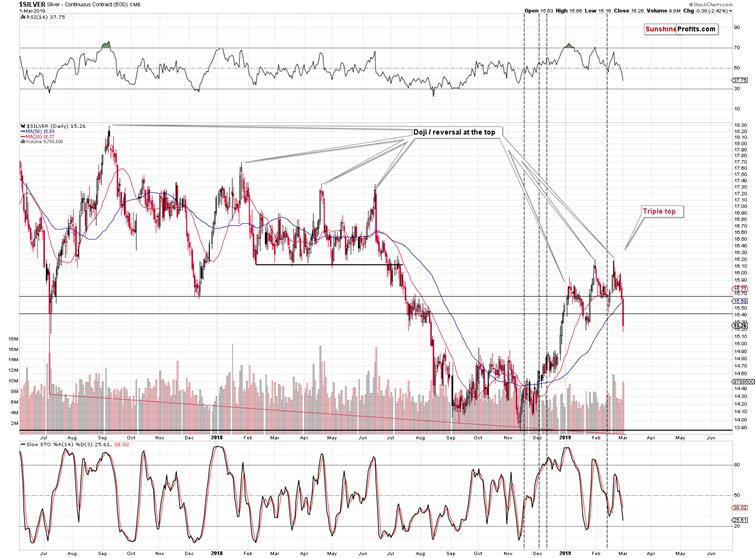
Silver topped three times this year and it appeared to be breaking higher, and… It’s already at new 2019 lows in today’s pre-market trading. It’s likely to erase late-2018 gains relatively soon, just like we discussed in the previous Alerts.
The triple top may also be viewed as a head-and-shoulders top, and its implications are bearish regardless of whether we view it as the former or the latter.
The entire similar pattern that we marked on the previous long-term silver chart is bigger than the current one, so it’s not that surprising to have the three tops closer to each other now than they were in 2012 and 2013.
The number of confirmations and similarities is astonishing. The implications are extremely bearish. And this is the case even without taking into account the invalidation of silver’s breakout above the long-term resistance line and multiple long-term signals from other markets that we have featured previously, and that we will update in our following analyses.
As far as silver is concerned, the above analogy implies a move back to the 2008 bottom. This projection means silver not only below $10, but below $9. Silver at about $8.90 and gold at about $890 means the gold to silver ratio at about 100, which is exactly what we expect to see in case of the ratio in the following months. That’s where the true long-term resistance is – not at the current levels.
Let’s not forget about the price analogy to the 2008 bottom. We marked it (orange lines and ellipses) on silver’s very long-term chart a long time ago, and it remains up-to-date. The starting points and the size of price moves have been almost identical to the 2007-2008 performance and also to the 2015 one – and now the price is on the move. There is no analogy in terms of time, but the one in terms of price remains very strong. In 2008, silver bottomed at $8.40. This price is unthinkable at this time, but it was just as unthinkable in 2008, when silver was above $20. And it still declined to this level.
The first shock to most silver bulls will take place when the white metal breaks below the 2015 bottom and they can no longer repeat the mantra that the final bottom had been in. Many people will drop their investments at that time and the decline would likely quickly accelerate on its downward path. The next support levels are close to the $12 level. Perhaps this level will correspond to $1,050 in gold or perhaps it will correspond to a higher gold price – it’s unclear at this time.
On a side note, we are silver bulls as well, but we think that silver needs to first plunge before starting its profound rally that will take it well above 2011 highs. The PMs bear market has to end first – and we know how bear markets tend to end: with fear and blood in the streets.
Summary
Summing up, it’s almost certain that the next big move lower has already begun and that the 2013-like slide is in its early stage. Based on the updated version of the 2013-now link, the implications are even more bearish than we had initially assumed. The downside target for gold remains intact ($890), but it seems that the price moves in silver and mining stocks will take them even lower than we had originally thought. A move below $9 in silver, and a move to or below 80 in case of the HUI Index (perhaps much lower on a very temporary basis) are not out of the question.
In other words, the precious metals market is likely to erase everything that it had gained in the last several days, weeks, and months, and then decline much more before THE bottom is in.
We hope you enjoyed today’s analysis, and we encourage you to sign up for our free newsletter. You’ll be updated on our free articles on a daily basis, and you’ll get access to our premium Gold & Silver Trading Alerts for the first 7 days as a starting bonus. And yes, it’s free. Sign up today.
Thank you.
Przemyslaw Radomski, CFA
Founder, Editor-in-chief
Tools for Effective Gold & Silver Investments - SunshineProfits.com
Tools für Effektives Gold- und Silber-Investment - SunshineProfits.DE
* * * * *
About Sunshine Profits
Sunshine Profits enables anyone to forecast market changes with a level of accuracy that was once only available to closed-door institutions. It provides free trial access to its best investment tools (including lists of best gold stocks and best silver stocks), proprietary gold & silver indicators, buy & sell signals, weekly newsletter, and more. Seeing is believing.
Disclaimer
All essays, research and information found above represent analyses and opinions of Przemyslaw Radomski, CFA and Sunshine Profits' associates only. As such, it may prove wrong and be a subject to change without notice. Opinions and analyses were based on data available to authors of respective essays at the time of writing. Although the information provided above is based on careful research and sources that are believed to be accurate, Przemyslaw Radomski, CFA and his associates do not guarantee the accuracy or thoroughness of the data or information reported. The opinions published above are neither an offer nor a recommendation to purchase or sell any securities. Mr. Radomski is not a Registered Securities Advisor. By reading Przemyslaw Radomski's, CFA reports you fully agree that he will not be held responsible or liable for any decisions you make regarding any information provided in these reports. Investing, trading and speculation in any financial markets may involve high risk of loss. Przemyslaw Radomski, CFA, Sunshine Profits' employees and affiliates as well as members of their families may have a short or long position in any securities, including those mentioned in any of the reports or essays, and may make additional purchases and/or sales of those securities without notice.
Przemyslaw Radomski Archive |
© 2005-2022 http://www.MarketOracle.co.uk - The Market Oracle is a FREE Daily Financial Markets Analysis & Forecasting online publication.