


US Yield Curve Inverted Months Earlier than Most Think
Interest-Rates / Inverted Yield Curve Aug 01, 2019 - 04:55 PM GMTBy: John_Mauldin

 The inverted yield curve is one of the more reliable recession indicators.
I discussed it at length last December. At that point, we had not yet seen a full inversion. Now we have, and it appears the curve was “inverted” back then, and we just didn’t know it.
The Powell Fed spent 2018 gradually raising rates and reducing the balance sheet assets it had accumulated in the QE years.
This amounted to an additional tightening. In fact, the balance sheet reduction may have had more impactthan lower rates.
Now if you assume, as Morgan Stanley does, every $200B balance sheet reduction is equivalent to another 0.25% rate increase, which I think is reasonable, then the curve effectively inverted months earlier than most now think.
Worse, the tightening from peak QE back in 2015 was far more aggressive and faster than we realized.
Worrisome Charts
Let’s go to the chart below. The light blue line is an adjusted yield curve based on the assumptions just described.
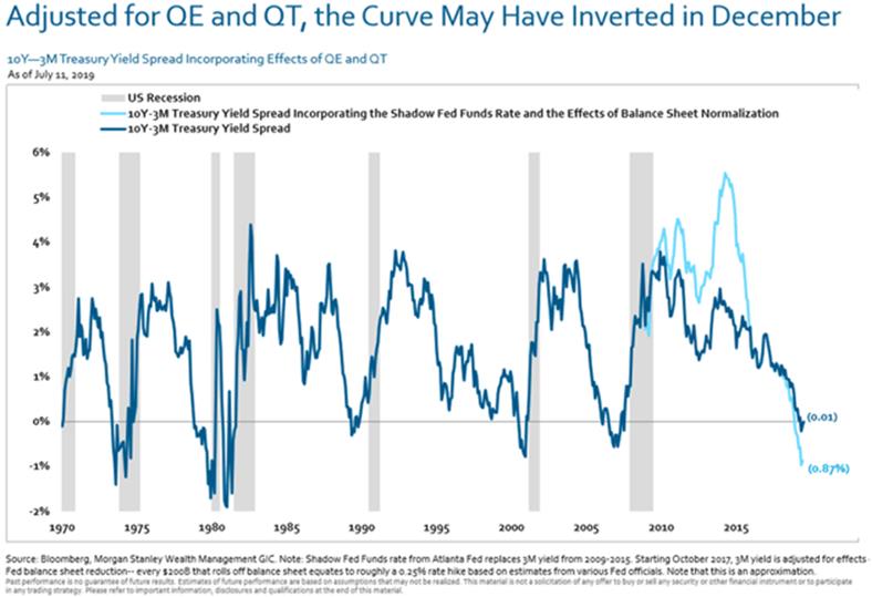
Source: Morgan Stanley
But even the nominal yield curve shows a disturbingly high recession probability. Earlier this month, the New York Fed’s model showed a 33% chance of recession in the next year.
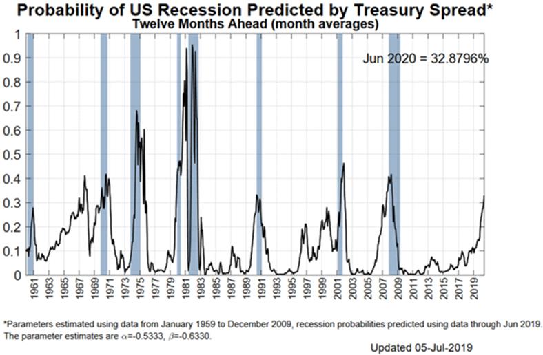
Source: New York Fed
Their next update should show those odds somewhat lower as the Fed seems intent on cutting short-term rates while other concerns raise long-term rates.
But it’s still too high for comfort, in my view.
But note that whenever the probability reached the 33% range (the only exception was 1968), we were either already in a recession or about to enter one.
For what it’s worth, I think Fed officials look at their own chart above and worry. That’s why more rate cuts won’t be surprising.
And frankly, and I know this is out of consensus, I would not rule out “preemptive quantitative easing” if the economy looks soft ahead of the election next year. Just saying…
But that’s not everyone’s view.
The Other Side of the Argument
Gavekal Research gives us this handy chart showing inversions don’t always lead to recession right away. (I noted 1968 above and I think 1998 is a separate issue. But then again, that’s me.)
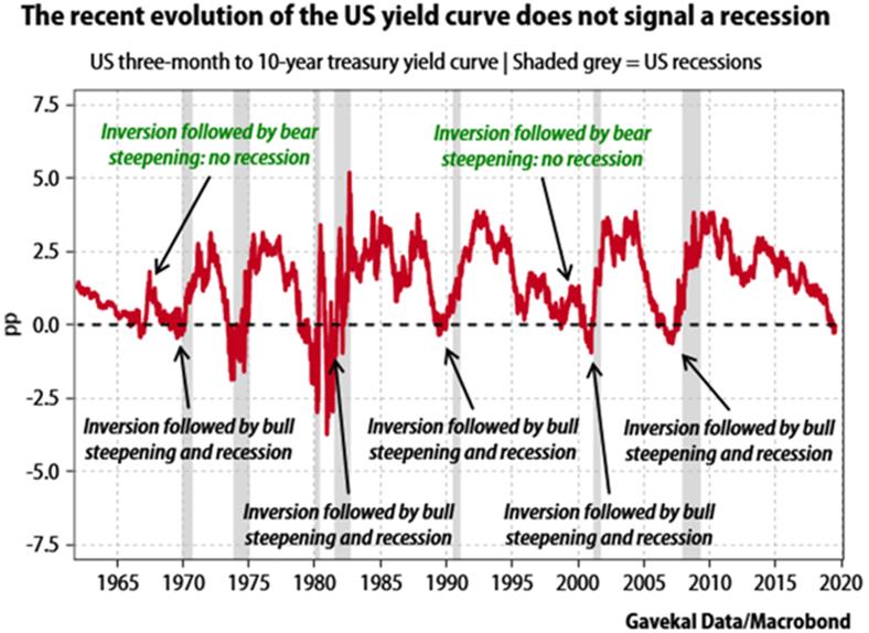
Source: Gavekal Research
Fair enough; brief inversions don’t always signal recession. But as noted, when you consider the balance sheet tightening, this one hasn’t been brief.
Note also that an end to the inversion isn’t an all-clear signal. The yield curve is often steepening even as recession unfolds.
One thing seems certain: While the yield curve may not signal recession, it isn’t signaling higher growth, either. The best you can say is that the mild expansion will continue as it has. That’s maybe better than the alternative, but doesn’t make me want to pop any champagne corks.
An inverted yield curve is similar to a fever. It simply tells us something is wrong in our economic body. And sadly, at least historically, it is right.
The Fed has always been behind the curve. To Powell’s credit, he may be trying to get in front of it, at least this time.
The Great Reset: The Collapse of the Biggest Bubble in History
New York Times best seller and renowned financial expert John Mauldin predicts an unprecedented financial crisis that could be triggered in the next five years. Most investors seem completely unaware of the relentless pressure that’s building right now. Learn more here.
John Mauldin Archive |
© 2005-2022 http://www.MarketOracle.co.uk - The Market Oracle is a FREE Daily Financial Markets Analysis & Forecasting online publication.