


The Incredible World of Gold Stock Chartology
Commodities / Gold and Silver Stocks 2019 Sep 23, 2019 - 06:42 PM GMT

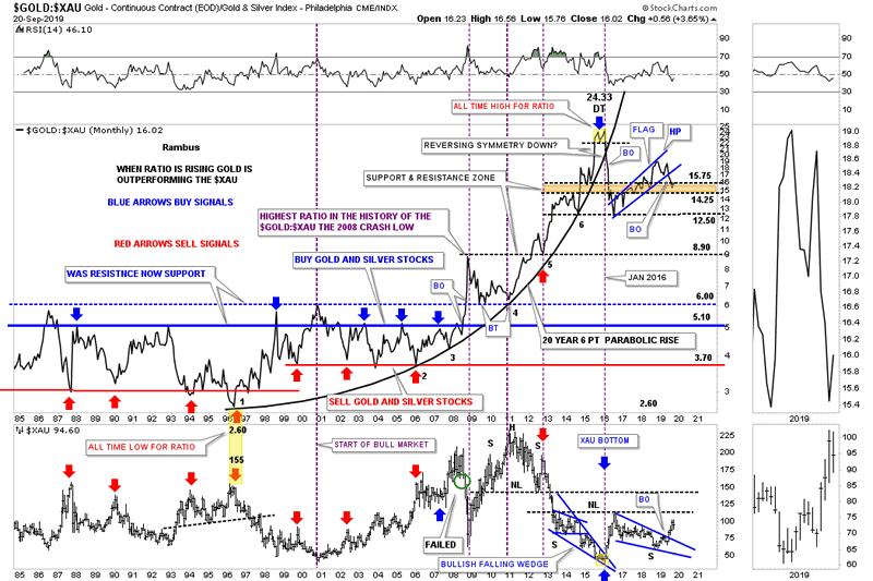
 Tonight I would like to start out by looking at the old ratio combo chart that has the GOLD:XAU ratio chart on top with the XAU on the bottom. I’m not going to go over all the details the ratio combo chart has, only to emphasize the 20 year 6 point parabolic arc which shows how gold had been outperforming the XAU until the small double top at 24.33 in late 2015. When the parabolic arc was broken to the downside in early 2016 that strongly suggested that it was going to be the XAU’s turn to outperform gold.
Initially, you can see the sharp vertical move down that broke the back of gold outperforming the XAU at 12.50. From the low in early 2016 the ratio had been building out the blue rising flag until the bottom rail was broken to the downside just 3 months ago in June. Since then the ratio has been in backtest mode to the bottom rail of the rising flag which looks like it could be coming to an end which shows up better on the weekly chart we’ll look at later.
As you can see I’ve labeled the blue rising flag as a halfway pattern that could very well lead to a vertical move lower similar to the one we seen off the double top at 24.33. If that ends up being the case then the XAU, on the bottom chart, will be a halfway pattern to the upside. The big question regarding the GOLD:XAU ratio is, will the old trading range between 3.70 and 5.10 come back into play at some point in the future? If that is the case then the XAU and PM stocks in general have a lot of catching up to do and should outperform gold in a big way going forward.
Next is the weekly line combo chart for the GOLD:XAU ratio on top with the XAU on the bottom that focuses in on the shorter term look. As you can see the ratio chart on top has clearly broken the bottom rail of the blue rising flag and has been in backtest mode. The XAU on the bottom chart has clearly broken out of its 2016 bullish falling wedge inversely to the ratio chart.
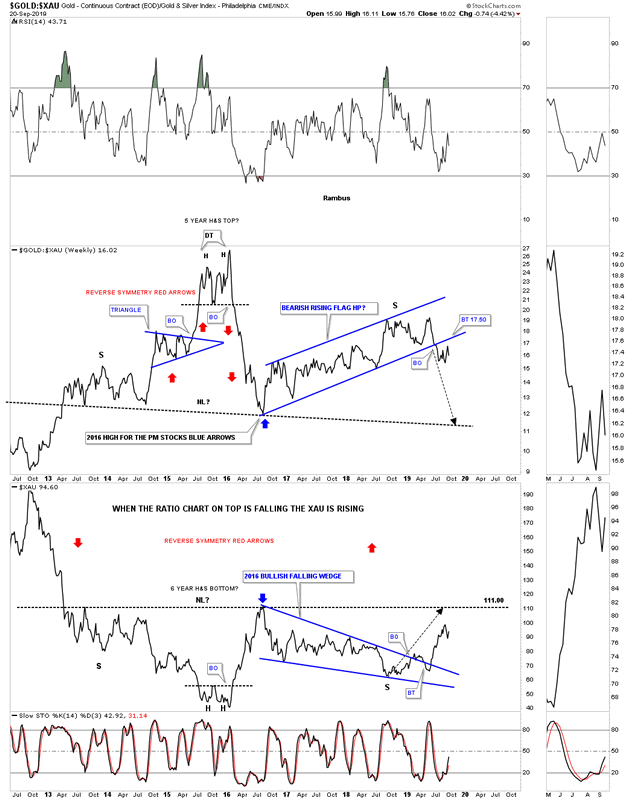
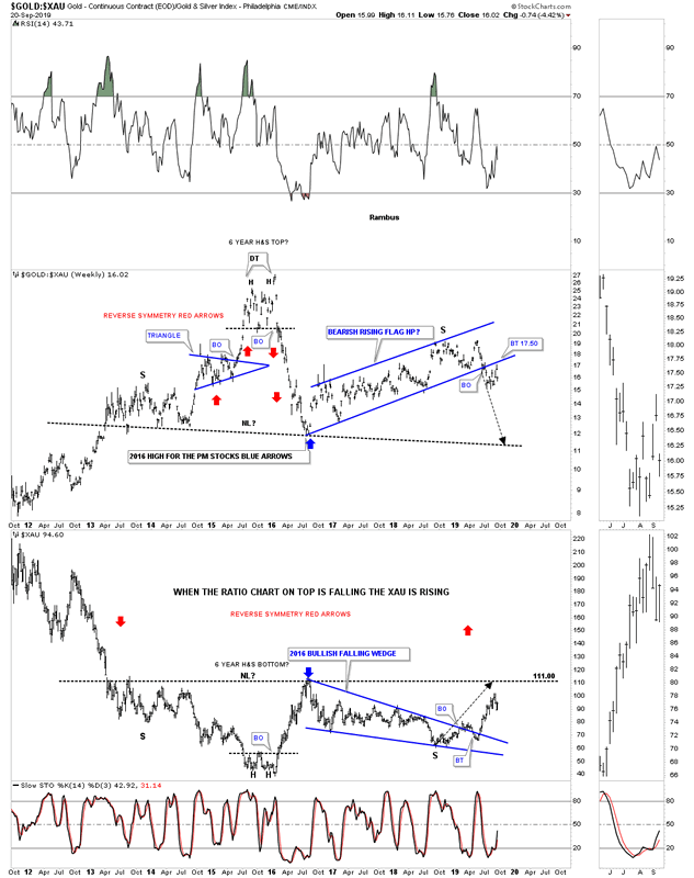
Below is the exact same combo chart as the one above but I’ve changed the setting to show a bar chart instead of a line chart. It looks like 2 weeks ago the price action backtested the bottom rail of the rising flag which may now be complete. You may have also noticed the massive H&S top on the ratio chart and the H&S bottom on the XAU that are still in play. Unlike gold which has already broken out of its 6 year H&S base the XAU along with the rest of the PM stock indexes have yet to breakout of their massive H&S bases which really puts things into perspective IMHO.
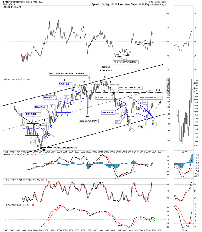
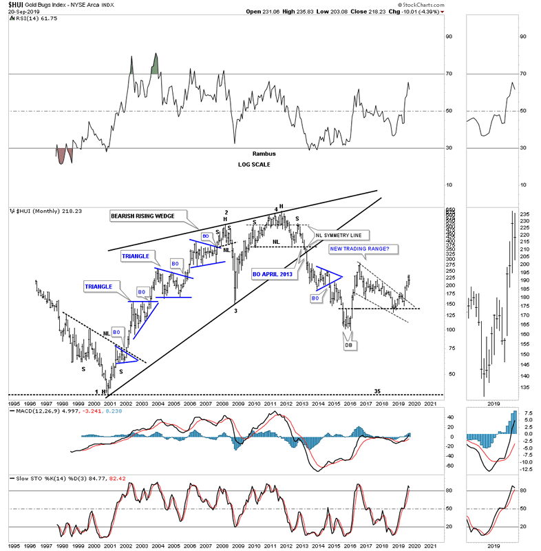
It’s been awhile since we last looked at this long term monthly chart for the HUI which shows its entire history and all the Chartology. You may recall that when the price action was still trading inside of the 2016 bullish falling wedge I was looking for a possible touch of the bottom rail of the major bull market uptrend channel that would have been hit around the 120 area. The actual low for the 2016 bullish falling wedge was about 10 points higher at the 130 area for the 4th reversal point.
You’ve often seen me point out the 2008 crash in the PM complex. If you were trading back then you know exactly what I mean by crash. On the other hand there are new investors in the PM complex that never felt the pain of that crash event which is unfortunate as it was a good learning lesson. You can see what the crash looks like on this history chart for the HUI.
For me personally I was able to see the 2008 H&S top forming well before it broke down. There were very few leveraged etf’s back then in the PM complex so I ended up buying DUG which is a 2 X short oil etf and SMN which is a 2 X short the basic materials sector. I was able to sidestep that crash and actually did very well with just those two 2 X etf’s.
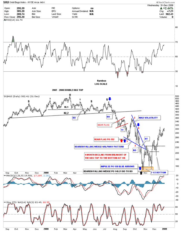
Below is what that 2007 – 2008 H&S top looked like at the time. It seemed pretty obvious to me what was building out but keep in mind that was at the height of the bull market that had been underway since 2001. Emotions were running high and nobody could remotely imagine the PM complex crashing. Even though I saw the H&S top building out I had no idea the crash would be as severe as it was, I only knew that a top of some degree was forming.
I was posting at the tent ( Goldtent) back then and this chart shows how I charted out the 2008 crash in real time.I took a lot of flack for daring to consider a bearish scenario . Outside of the H&S top being the dominate chart pattern the blue bearish falling wedge was the 2nd most dominate chart pattern. As you can see the volatility was incredible, something that new investors would have a hard time understanding as shown by the blue bearish falling wedge halfway pattern. Note the breakout below the bottom rail of the blue falling wedge with a nice clean backtest that lasted just two days which led to the final low 5 days later. Over the next 4 weeks or so the HUI formed a double bottom which officially ended the crash which led to the final rally into the 2011 top which you can see on the long term history chart above.
Since we are looking at old charts tonight here is one for the HUI that shows the bull market as one giant bearish rising wedge with the 2011 H&S top forming at the 4th reversal point. Note the massive breakout move below the neckline of the 2011 H&S top and the bottom rail of the bull market bearish rising wedge. That marked the second crash in 2013 which really set the tone for the bear market that followed. Whenever you see a long bar around an important breakout area that is a very good clue the breakout is going to stick. As you can see there was never a backtest to the bottom rail of the rising wedge which trapped most investors that didn’t get out in time.
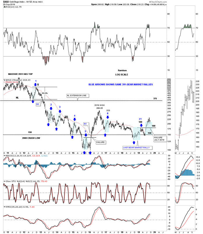
This next chart for the HUI is one we haven’t looked at in a long time which shows some interesting price structure. I can’t quite remember when I first discovered the link with each bear market rally being right at 39% as shown by the blue shaded areas and blue arrows. This all started with the height of the right shoulder high off the 2011 neckline blue #1. From that point on each bear market rally was right around 39%.
The first failure came at the 2016 low when the HUI rallied above the double bottom trendline labeled, failure. Note how the price action showed lower lows and lower highs from the right shoulder high to the 2016 low. That is classic bear market action. After the 2016 high was in place and the first decline finished the HUI was back to its old habit of a 39% bear market rally at #6. The HUI then began its last important decline which ended a year and half later in September of 2018.
What still blows me away is the fact that the HUI rallied 39% off the September 2018 low to the high at 180 labeled #7 and began to decline once more. This time though the decline stopped at the old crash low at 150 and began to rally. Once the price action rallied above 180 that created a higher high something that hadn’t been done since the HUI rallied above the double bottom trendline in 2016. You can see our latest rally off the previous low at 150 is now the 2nd biggest rally since the 2016 rally phase. Our current rally is also the 2nd biggest since the bear market began at the head of the 2011 head and shoulder top. To put that into context we are now enjoying only the second biggest rally the HUI has had since the bear market began over 8 years ago to the month.
The bottom line is that whenever you see a H&S top or even a H&S bottom forming for that matter, don’t let your emotions get in the way of what the Chartology is suggesting. Emotions are the #1 reason why many investors lose money in the stock markets. Our new bull market in the PM complex is really just getting started that should last for many years. You are going to be faced with some real issues all the way which you are going to have to deal with. If you see a H&S top forming of some degree don’t let the herd sway you from what the Chartology is suggesting.
All the best
By Rambus Chartology
FREE TRIAL - http://rambus1.com/?page_id=10
© 2019 Copyright Rambus- All Rights Reserved
Disclaimer: The above is a matter of opinion provided for general information purposes only and is not intended as investment advice. Information and analysis above are derived from sources and utilising methods believed to be reliable, but we cannot accept responsibility for any losses you may incur as a result of this analysis. Individuals should consult with their personal financial advisors.
© 2005-2022 http://www.MarketOracle.co.uk - The Market Oracle is a FREE Daily Financial Markets Analysis & Forecasting online publication.