


Stocks Bear Market Focus Point: Bull Trap Warning
Stock-Markets / Stocks Bear Market Apr 21, 2012 - 06:06 AM GMTBy: Garry_Abeshouse

 Metal prices – A robot canary in the economic coal mine
Relative weakness in industrial metal prices can be a further sign of how the unravelling of the world’s major consuming economies can have a negative feedback effect on all countries down the supply chain. This includes countries supplying raw materials, through to low wage countries in the manufacturing sector – all of whom are at the mercy of market forces, corporate and government corruption and greed. Fear and greed are the mind killers. There is still plenty of greed left in the system and fear is just round the corner. Just ask the nouveau riche exporting their billions in cash out of China into Hong Kong and elsewhere. They know what’s coming and are preparing for their day of reckoning.
But within the isolation chamber called the USA - who cares about tomorrow. Key equity indices are at all-time highs, they have their iPods, iPhones and iPads – all made with Chinese slave labour and their most vocal citizens resent a black highly intelligent President and want him out even if they destroy their country in the process of Armageddon – it will all be worth it in the end. These same people also believe that the world appeared out of nowhere a few thousand years ago. Go figure. Where are America’s intellectuals when you need them. Why are they confining their muted comments to the intelligent publications that no one reads? The Bull Trap is coming and no one cares!
The thing about Bull Traps is that they are designed to catch all the Bull.
I have always been a firm believer that in financial markets, gravity eventually wins out over unrealistic expectations. So with key US indices still around the 2008 levels – obviously in the realms of fantasy and the copper price at similar levels something has to give. The signs are all there you just have to look for them.
When they are not being manipulated for trading purposes, changes in the prices of key industrial commodities such as oil and copper, have always been important bellwethers for world economic activity.
Changes in the way currencies, industrial metal prices and equity prices move relative to each other are of prime importance to me as I try to sort out which way they are most likely to go. Whether it is near or long term - relativity is important, as the nuances of their ups and downs continually challenge us to lateralise our thinking. Charts in their empiric simplicity, can be a useful tool for following the often erratic movements of price over time. They enable us to use recognisable patterns and trends to replace the confusion of the financial market place with some sort of order. And with order, analysis may be possible and conclusions made.
These charts that we follow exist in the real world of multiple trading arenas, multiple time zones, high frequency trading and with trading liquidity often hidden from view in ‘dark pools’ behind closed doors. Most of the money involved in this trading is by governments, banks, hedge funds and large corporations. Hiding what is really happening is an art form used by all these entities to obscure the truth from being available to all and sundry.
Enter one John Williams from Shadow Government Statistics. He provides ‘a service that exposes and analyses flaws in current U.S. government economic data and reporting, as well as in certain private-sector numbers, and provides an assessment of underlying economic and financial conditions, net of financial-market and political hype.’ – to sift through the all the spin, doublespeak and media corporate and self-sponsorship to find out what is really going on in the worlds of finance and government statistics. I recommend you check out his website.
But despite these obvious distortions and misrepresentations in the financial markets, charts remain a useful tool for analysing market action. As analysts, we are constantly challenged by the fore-mentioned inequities and distortions to search beneath the obvious in order to emerge with occasionally useful small morsels ‘truths’. In fact my biggest surprise of late is that despite all of these aforementioned problems, charts are as relevant now as they always were – you just need to be very careful and selective in terms of what you use and how you use them.
As you may have seen from my postings here, many of the traditional chart patterns first identified and described by the early Technical Analysts in the 1930’s and 1940’s, remain alive and well in in their current reincarnations and are as relevant today as they were then.
Market tops nearly three years old must be taken very seriously
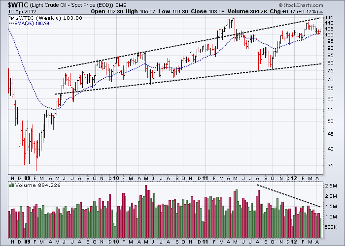
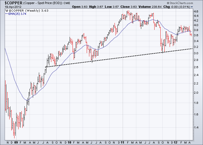
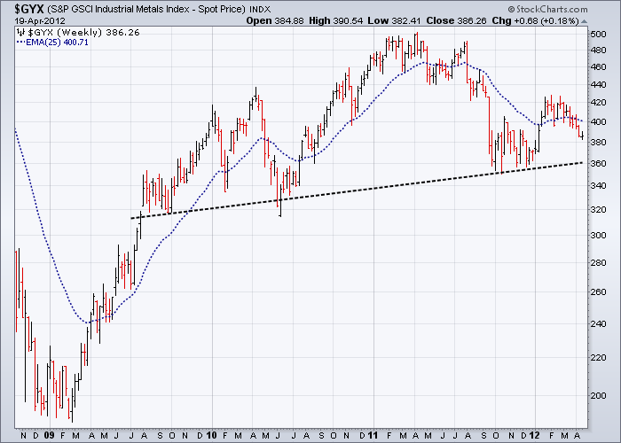
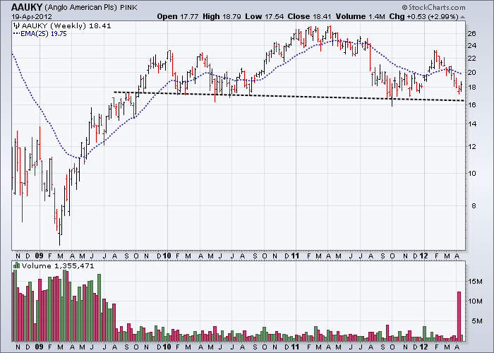
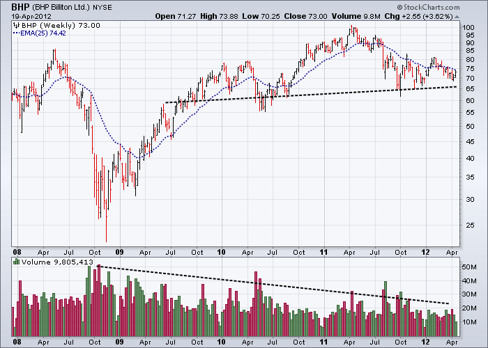
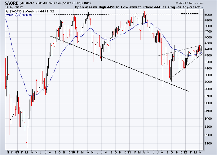
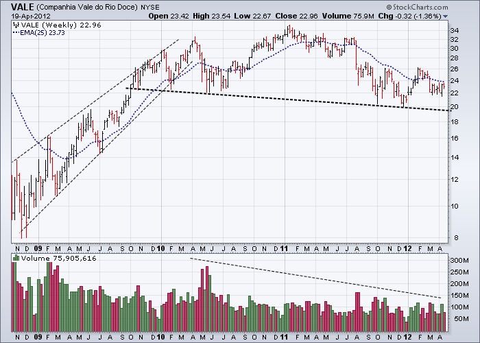
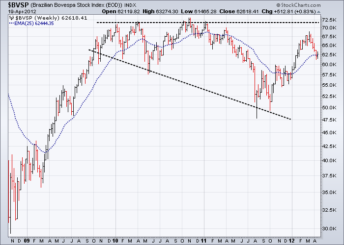
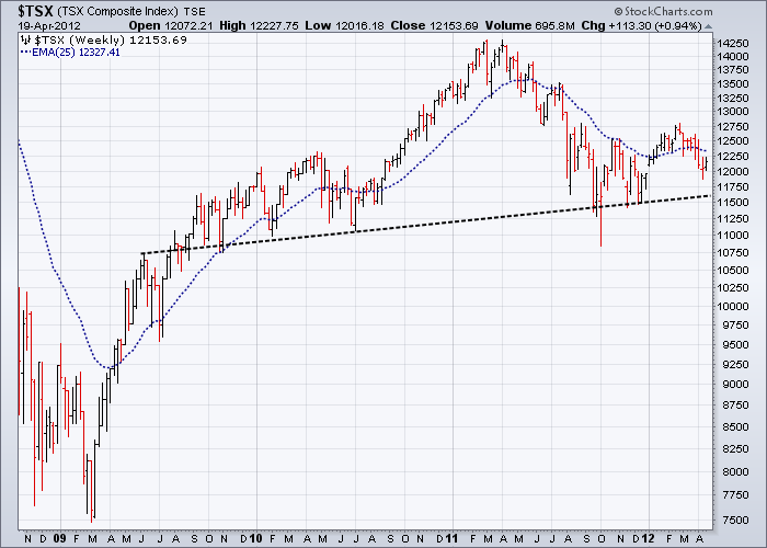
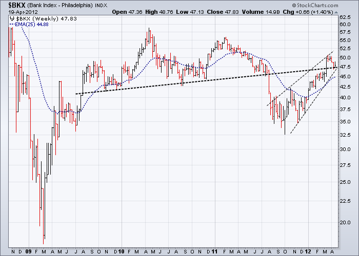
My view has always been that analysing charts in various groupings gives superior results than analysing just one in isolation. Ten of the eleven charts below essentially stopped going up and have been moving horizontally since the third quarter of 2009. Together they provide a broad-based snapshot of industrial metal prices, oil prices, the mining industry and three of the biggest mining based economies in the world. For good measure I have also included the highly respected and almost equal weighted Philadelphia Banking Index. What they all have in common is potentially large tops - all nearly three years old. Not something market analysts should be treating lightly.
Very little future weakness is required to confirm the tops showing Head & Shoulder type patterns, as current prices are mostly just above their necklines. Any move down in prices confirming these tops combined with a fall in the Euro below 1.3000, would be probably be enough to confirm that the bear market in equities is continuing. The remainder of the tops shown are equally bearish but with different shaped patterns including broadening formations often ending in bearish upward wedge type patterns.
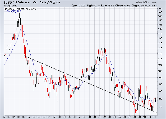
The only chart below with no top is the USD. In fact the USD has potentially a large base. Space forbids me here to show you the other currencies, but the main trading currencies such as the Euro, AUD, British Pound and the Canadian Dollar all rose against the USD between 2001 and 2008. During this time the USD fell sharply against all the major floating currencies and has been essentially basing out ever since. From a technical point of view it is far more difficult for the USD to have a steep fall from here than the other major currencies – despite the constant rhetoric to the contrary.
Commodities – Spot prices – Weekly Charts
Equities – Weekly Charts
Global
Australia
Brazil
Canada
Bank Index - Weekly
USD – Monthly Chart from 1982
A final word
I shall leave you with a sobering quote from Adam Davidson’s thought provoking article entitled ‘Making it in America’ from The Atlantic Magazine, where he commented how:
‘‘Factories (in America) have replaced millions of workers with machines. Even if you know the rough outline of this story, looking at the Bureau of Labor Statistics data is still shocking. A historical chart of U.S. manufacturing employment shows steady growth from the end of the Depression until the early 1980s, when the number of jobs drops a little. Then things stay largely flat until about 1999. After that, the numbers simply collapse. In the 10 years ending in 2009, factories shed workers so fast that they erased almost all the gains of the previous 70 years; roughly one out of every three manufacturing jobs—about 6 million in total—disappeared. About as many people work in manufacturing now as did at the end of the Depression, even though the American population is more than twice as large today.’
Also from the UK Guardian recently:
‘The decimated textile sector is one aspect of the decline of French manufacturing. Only 5 per cent of the clothes sold in France are made in France. Across all industrial sectors, more than 750,000 jobs have been lost in 10 years’
Something to think about.
Till next time.
Garry Abeshouse
Technical Analyst.
Sydney
Australia
I have been practicing Technical Analysis since 1969, learning the hard way during the Australian Mining Boom. I was Head Chartist with Bain & Co, (now Deutsch Bank) in the mid 1970's and am now working freelance. I am currently writing a series of articles for the international "Your Trading Edge" magazine entitled "Market Cycles and Technical Analysis".
I specialise in medium to long term market strategies.
© Copyright Garry Abeshouse 2012
Disclaimer: The above is a matter of opinion provided for general information purposes only and is not intended as investment advice. Information and analysis above are derived from sources and utilising methods believed to be reliable, but we cannot accept responsibility for any losses you may incur as a result of this analysis. Individuals should consult with their personal financial advisors.
© 2005-2022 http://www.MarketOracle.co.uk - The Market Oracle is a FREE Daily Financial Markets Analysis & Forecasting online publication.