Stocks Bear Market, Is This 1929 All Over Again?
Stock-Markets / Stocks Bear Market Aug 26, 2015 - 12:53 PM GMTBy: Austin_Galt
 The Dow has been smashed over the last week which has brought out the usual doom and gloomer’s predicting Armageddon once again. There are several so called experts now predicting a 1929 style bear market.
Admittedly, it is hard not to get caught up in the emotion of days where the market sees a 1000 point intraday drop. So, is this really 1929 all over again? Well, for those that can’t be bothered to read the analysis, the short answer is no. Not as far as I’m concerned anyway.
To come to this conclusion, I analysed previous tops that preceded major crashes using the same set of indicators. The tops include those in 1929, 1987 and 2007. Then we will compare those tops to the current 2015 top.
Now I like to keep things simple by using my favourite upper and lower indicators being the PSAR indicator and Bollinger Bands and RSI and MACD indicator. Don’t get me wrong, there are many other more complex tools available but I’ve found this is what works for me. Add to that a reasonable understanding of market psychology which is obtained from many years staring at thousands of charts!
If a serious crash really is to occur then we are dealing with big picture stuff so we will use the monthly and weekly charts for the analysis. I’ll leave the daily charts for the whippersnappers.
So, let’s begin with the Big Daddy of them all, the 1929 crash.
1929 MONTHLY CHART
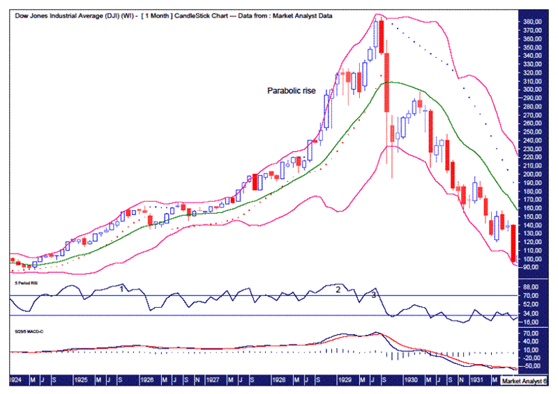
We can see a parabolic rise into the final high which is so often found at the end of bull trends. Check.
The Bollinger Bands show price heading straight to the lower band before bouncing back up to the middle band and then getting smashed again.
The PSAR indicator shows price busting the dots and then being held by them as the downtrend continued.
The RSI set up a triple bearish divergence at the final high.
The MACD showed no bearish divergence with just the one bearish crossover.
1929 WEEKLY CHART
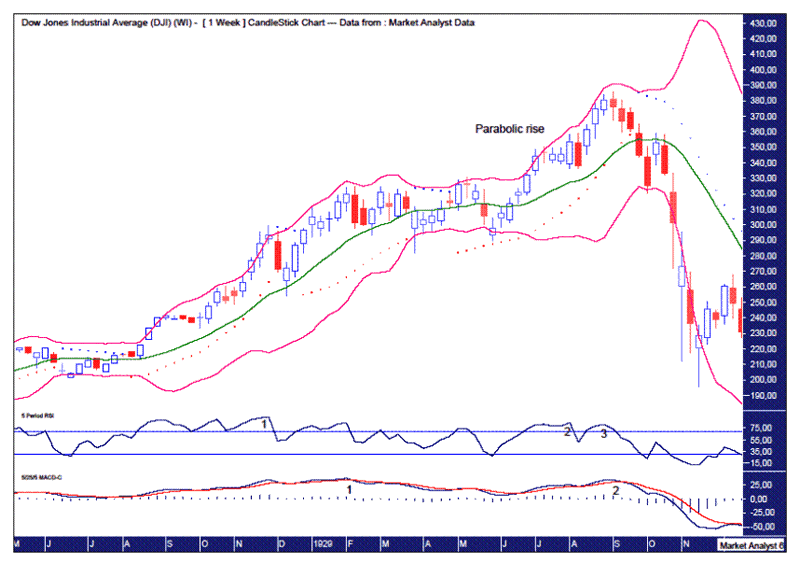
The weekly chart also shows a parabolic rise at the end of the bull trend.
The Bollinger Bands show price headed straight to the lower band before bouncing back up to the middle band and then getting crunched.
The PSAR indicator shows price busting the dots and then being held as price continued south.
The RSI showed a triple bearish divergence at the final high.
The MACD showed a bearish divergence at the final high.
Ok, now let’s move on to the most recent crash in 2008 coming off the 2007 top to see how these same indicators fared.
2007 MONTHLY CHART
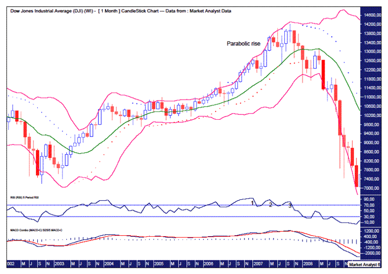
We can see a parabolic rise into top which only really started around mid 2006. It is not as notable as the parabolic rise in 1929 but it is still noticeable.
The Bollinger Bands show price heading straight to the lower band before bouncing back to the middle band and then proceeding to get absolutely slaughtered.
The PSAR indicator shows price busting the dots on the downside which then held the subsequent downtrend.
The RSI showed a triple bearish divergence at the final high.
The MACD showed no bearish divergence with just the one bearish crossover the only indication.
2007 WEEKLY CHART

The weekly chart shows a parabolic rise into high. There are actually two parabolic rises as there was a deep correction before price surged again to set up a false break top.
The Bollinger Bands show price heading straight to the lower band after the final high. From there price rallied back to the middle band before succumbing to the bearish pressures.
The RSI showed a triple bearish divergence at the final high.
The MACD showed a bearish divergence at the final high.
Ok, we have some very clear similarities already identified between the 1929 and 2007 tops. Both tops show parabolic rises while both the upper and lower indicators are identical.
Now let’s look at the 1987 top which is a bit different. This crash was a bit different in that it was very quick being less than three months and looks more like a hard correction than a crash.
1987 MONTHLY CHART

We can see a parabolic rise into top. Check.
The Bollinger Bands show price heading straight to the lower band and that is where it found support and was the able to rally back to the upper band and continue on to new highs.
The PSAR indicator shows price busting the dots on the downside but then busting the dots on the upside not long after it had got back to the upper Bollinger Band. This busting of PSAR support was a fake out.
The RSI showed only a bearish divergence at the final high.
The MACD showed no bearish divergence with only the one bearish crossover before the crash.
1987 WEEKLY CHART
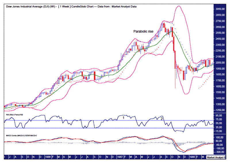
We can see the parabolic rise on the weekly chart.
The Bollinger Bands show price heading straight to the lower band and just getting hammered without any rally back to the middle band.
The PSAR indicator shows price busting the dots and then holding price for the duration of the downtrend.
The RSI shows only one bearish divergence.
The MACD shows no bearish divergence.
So, there are some difference between this 1987 top and the 1929 and 2008 tops.
Now let’s look at the 2015 top.
2015 MONTHLY CHART
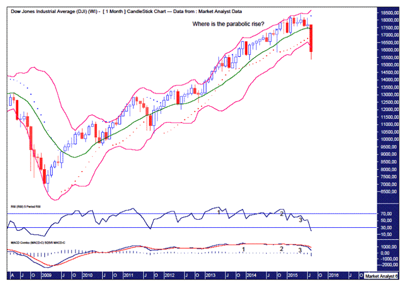
The first thing that stands out is there is no discernible parabolic rise. Where is it? I can’t see it. It looks like a steady rise to my eye. Do I need glasses? I don’t think so.
The Bollinger Bands show price heading straight to the lower band. What does it do from here?
The PSAR indicator shows price busting the dots on the downside. Is this a fake out or will the dots now hold price as the downtrend continues?
The RSI shows a triple bearish divergence at the high.
The MACD indicator also shows a triple bearish divergence at the final high.
Hmm. Some discrepancies exist here between this chart and the other tops. Let’s have a looks at the weekly chart.
2015 WEEKLY CHART

Where is the parabolic rise?
The Bollinger Bands show price gradually moving to the lower band but not heading straight there as price did in every other chart shown so far.
The PSAR indicator shows price busting the dots after the final high but then rallying back up to bust the dots on the upside coming back down and getting smacked over the last week.
The RSI showed a quadruple bearish divergence at the top.
The MACD also showed a quadruple bearish divergence at the final high.
So, what to make of this analysis?
Well, I am looking for a serious correction but I am not a mega-bear. Not yet anyway. Having called the May 2015 top on the day after it occurred I have been bearish ever since looking for a correction of at least 30%.
However, technical analysis is about constantly reassessing the situation and sometimes expectations change with these reassessments. Certainly, seeing all the permabears reappear on TV has given me a good case of the heebie-jeebies about my expectation of an even bigger correction. No, I haven’t forgotten about the bearish 7 year cycle either but it just seems to be everyone is talking about it this time around.
There are just too many discrepancies between both the lower and upper indicators from the 2015 charts and those on the 1929 and 2007 charts. The 1987 chart is different again and seems to be in a world unto itself. The fact that the 2015 charts show more bearish divergences may be acting as a kind of fake out. Certainly, the divergences warrant a significant decline which we have already seen. But a crash? I doubt it. I am not expecting a massive stock market bust anyway and this just adds to my confidence about that.
The most troubling and obvious difference between the 2015 chart and the other charts is the lack of a parabolic rise into top. Every other crash shown has been preceded by a parabolic rise into top.
One possibility is there is a 5 point broadening top playing out with the September 2014 high point 1, the October 2014 low point 2, the May 2015 high point 3 and price currently in the process of putting in a point 4 low. Then perhaps we get a parabolic rise into a final point 5 high. The move up from the point 2 low is somewhat parabolic in nature but seems to be clutching at straws compared to the other charts.
Now I’m not saying price won’t continue heading south from here. I am just pointing out that the indications from the 2015 charts are out of whack with the 1929 and 2007 charts which are identical. These latter two charts should provide the roadmap going forward to see if we really are in the throes of a major crash.
And for the doom and gloomer’s out there, I ask again. Where is the parabolic rise?
By Austin Galt
Austin Galt is The Voodoo Analyst. I have studied charts for over 20 years and am currently a private trader. Several years ago I worked as a licensed advisor with a well known Australian stock broker. While there was an abundance of fundamental analysts, there seemed to be a dearth of technical analysts. My aim here is to provide my view of technical analysis that is both intriguing and misunderstood by many. I like to refer to it as the black magic of stock market analysis.
Email - info@thevoodooanalyst.com
© 2015 Copyright The Voodoo Analyst - All Rights Reserved
Disclaimer: The above is a matter of opinion provided for general information purposes only and is not intended as investment advice. Information and analysis above are derived from sources and utilising methods believed to be reliable, but we cannot accept responsibility for any losses you may incur as a result of this analysis. Individuals should consult with their personal financial advisors.
Austin Galt Archive |
© 2005-2022 http://www.MarketOracle.co.uk - The Market Oracle is a FREE Daily Financial Markets Analysis & Forecasting online publication.


