Corn – Smart Money Putting On Short-Squeeze Clinic
Commodities / Commodities Trading Jan 27, 2013 - 01:29 PM GMTBy: Michael_Noonan
 While most eyes remain fixed on gold and silver, and the stock market, to a
lesser extent, the Fed having driven the little investor away, we take a fresh
look at the corn market. It has been some time since we last visited grains,
and corn deserves some attention. What do traders in PMs, S&P, Natural Gas,
Notes, or Corn have in common? To them, nothing. Being chart-driven, for
us all charts are the same. An opportunity is what we look for, and it matters
not from which sector that opportunity arises. Nor does not matter what the
underlying product is in any chart. We are equal-seeking opportunists.
We reference this as a short-squeeze clinic because if it can happen in corn, it
can happen in any market, [and does!]. This analysis also conveys why the best
source for information comes from the market itself. Starting with the monthly:
This chart is bullish for several reasons. There are consistently higher swing highs
and higher swing lows, the essence of a trending market. The higher the time, the
more pertinent and reliable the information. Price rallied to the last swing high in
just 3 months. Since that high, the correction lower has taken 5 months, or almost
twice as long to retrace only half the gain, another characteristic of a trending market.
Where price stopped is also important.
A horizontal line is drawn from the last large bar down, followed by an equally
large up bar, the first of the three bar rally to highs. The solid portion of that axis
line covers the then failed highs and the gap between rally bars 1 and 2 leading up
to 3. The remaining portion of the horizontal line is dashed to show how it extends
into the future, six months before price came back to retest that level. It is an axis
line because it acts as resistance to the left and then becomes support to the right,
and this same line shows up on three different time frames, attesting to its validity.
The decline also stopped just under a 50% retracement. In futures, there are
different contract changes that account for “wiggle room” in some price areas. In
horseshoes, this would be a “leaner.”
In all events, the market is sending an important message. When it shows up in all
three time frames, then we have ourselves a trade potential, with an edge. Edges are
good, in fact, preferred.

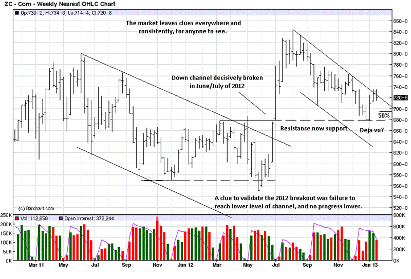
We have to chuckle over this chart. Prior to commenting on recent developing market
activity since the last swing high, we drew channel lines to capture the down move from
the June 2011 high to the May 2012 low. It led to the breakout shown for June/July
2012 on the chart. The observation was added at the bottom to show how the failure
for price to reach the bottom of the support channel line was a clue that the breakout
was likely to be more reliable. A similar channel was drawn for current activity for
comment and we then saw the “deja vu” moment. Point? Patterns repeat all the time.
You see the same axis line and how price retraced right to it. The 50% area was at 797,
again, close enough and a validation that December/January may have formed a low.

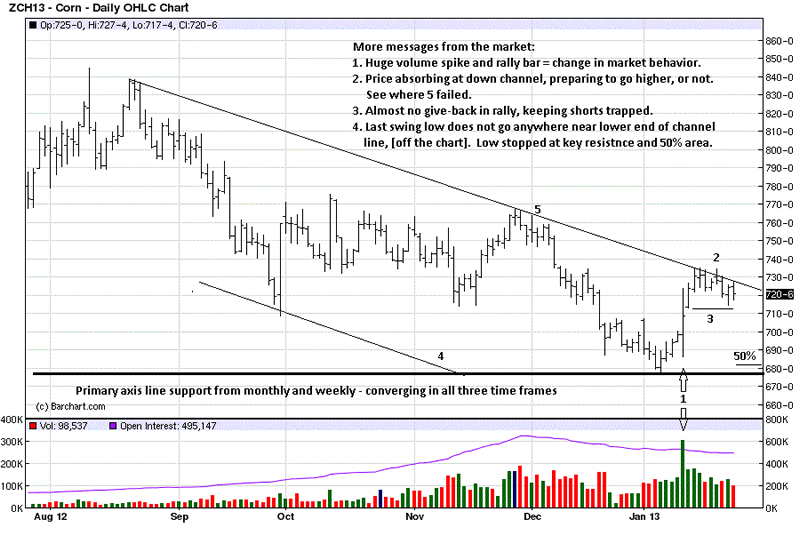
The daily time frame echoes the likelihood of a swing low for corn. The market messages
are very clear throughout the varying time frames. The huge volume and price spike at 1
was a “What the hell just happened?” moment, at the time. It was a day of massive short-
covering by smart money, and it also marked a change in the market’s character. That day merits closer inspection.
You have to pay attention whenever there is a large spike in volume and/or price range,
more especially when the spike occurs simultaneously. It is even more relevant when
this takes place at important support. The fact that this happened at a low indicates a
change of risk from weak hands into strong. Smart money takes important action at
highs and lows. You can be sure that the public does not generate high volume. High
volume is created for a reason…the change in risk, just mentioned. It marks the effort
of controlling influences to get the public out of their positions. How can one be sure?
Controlling influences are not sellers at lows; they are buyers. The sharp increase in
volume is them accumulating a market position. This reflects the exchange of risk, and
it is a visibly classic example of a short squeeze. A thorough analysis of several intra
day charts bears this out.
Back to the chart. 1.was just explained. At 2, it looks like price is absorbing seller’s
attempts to get price lower so shorts can cover at more reasonable prices and curtail
their losses. We added the comment, “or not” because there was similar activity at
the channel line at area 5, where price failed to go higher. Anything can happen.
You can see from 3. that there has been very little give-back in the form of a correction.
Longs have shorts by the shorts, and they will make them pay up to get out, giving no
opportunity to get out at lower levels. “You play, you pay.”
The similarities of the channel line on the weekly chart show where the current swing
low is way above the lower support channel, [not visible on the chart], and that is a
measure of underlying strength gathering for a trend change. The 50% retracement
is more exact on this chart because it measures the distance between swing high and
low within the same contract month.
One has to like the potential for corn from the long side. So says the market. We are
mere messengers.

By Michael Noonan
Michael Noonan, mn@edgetraderplus.com, is a Chicago-based trader with over 30 years in the business. His sole approach to analysis is derived from developing market pattern behavior, found in the form of Price, Volume, and Time, and it is generated from the best source possible, the market itself.
© 2013 Copyright Michael Noonan - All Rights Reserved Disclaimer: The above is a matter of opinion provided for general information purposes only and is not intended as investment advice. Information and analysis above are derived from sources and utilising methods believed to be reliable, but we cannot accept responsibility for any losses you may incur as a result of this analysis. Individuals should consult with their personal financial advisors.
Michael Noonan Archive |
© 2005-2022 http://www.MarketOracle.co.uk - The Market Oracle is a FREE Daily Financial Markets Analysis & Forecasting online publication.


