


Chartology of the Commodities: The Inflation/Deflation Barometer
Commodities / Commodities Trading Mar 07, 2017 - 07:08 AM GMT

 One of the biggest questions investors have is what type of environment are stocks and the economy in, deflation or inflation? Knowing the answer to that question can give you a heads up on what different sectors to invest in and what sectors to stay away from. Tonight I would like to update some of the different commodities indexes to see if they can give us any clues on which way the deflationary or inflationary pendulum is swinging. Commodities are often an under analysed asset class as compared to Stocks and Bonds. However they are the nuts and bolts , the real stuff supporting human existence.
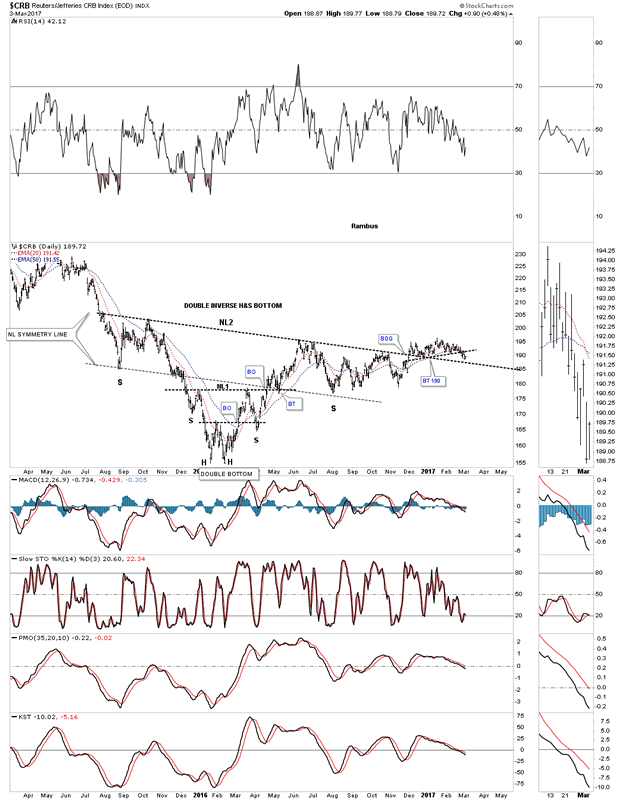
Lets start with one of the oldest commodities indexes around the $CRB index. After the huge impulse move down that began in the middle of 2014, the CRB index finally bottomed in early 2016, putting in a small double bottom which was going to be part of a bigger inverse H&S bottom. After breaking out above NL1 the CRB index then rallied higher stalling out below the 2016 high and began to decline once more. That decline found support at the neckline symmetry line which was a good place to look for a low for the right shoulder of a much bigger double H&S bottom. After trading below NL2 for six months the price action finally broke above it with just a small rally.
From a Chartology perspective nothing is broken yet on the double H&S bottom, but the price action has been very laborious since the December low of last year. Again, nothing is broken, but I see a yellow flag waving that is signaling caution in regards to the double H&S bottom, which we'll look at in more detail on the next chart to follow this one.
CRB Daily Chart
Whenever a breakout becomes very laborious it can be a sign of a failing pattern, not always, but sometimes, so it's important to pay close attention. This second chart shows the price action from the 2016 low with a possible ascending triangle building out. Note the price action at reversal point #4 in which the CRB index went nowhere since December. Last week the price action broke below the black dashed trendline and found support on the bottom rail of the black triangle last Friday and got a bounce. Now we have a support line at 188.79 with a resistance line just above at 191.50 which is the the black dashed S&R line or NL of a small H&S top. The price is converging into a very tight range which will show us which way the CRB index wants to go depending on which direction the breakout occurs.
CRB Daily Chart 2
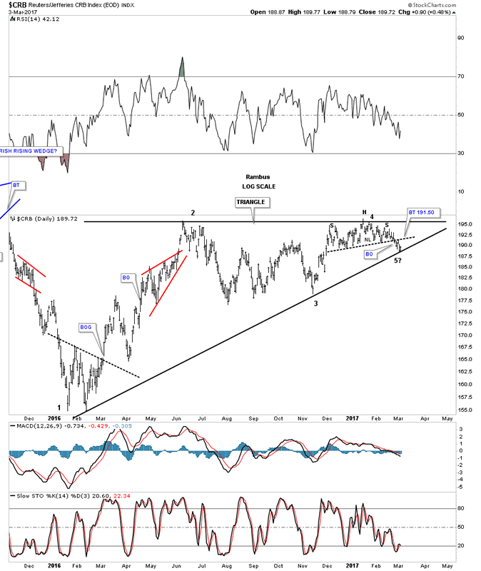
This next daily chart for the CRB index goes back almost 5 years and shows the parabolic downtrend we followed during the last deflationary decline that began in the middle of 2014. Taking a step back and looking at the bigger picture the 2016 triangle looks more convincing than the H&S bottom we looked at previously. If the triangle breaks out topside it will be a reversal pattern because it has 5 reversal points. On the other hand if the blue triangle breaks below the bottom rail it will have 4 reversal points and be a consolidation pattern to the downside. If that were to occur the price objective would be down to the 2016 low at a minimum.
CRB Daily Chart 3

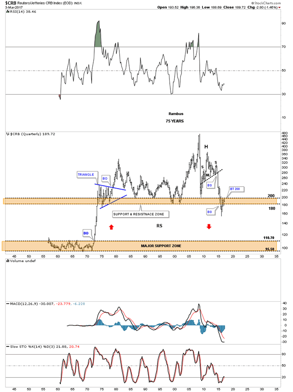
Below is a 75 year quarterly chart we were watching very closely during the last impulse move down, because it broke below the brown shaded support and resistance zone going all the way back to the early 1970's. When the price action was trading below the brown shaded S&R zone I speculated that we could see some reverse symmetry to the downside, as the rally back in the early 1970's was so vertical. Here we are a year or so later and the CRB index has rallied right up to the top of the brown shaded S&R zone at the 200 area. What had been support since the 1970's is now turning into resistance at the 200 area? Again, another important area to keep a close eye on.
CRB Quarterly Chart
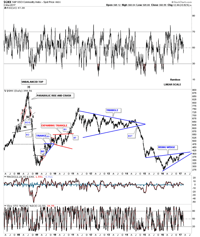
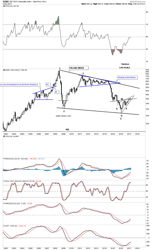
Below is a 10 year chart for the $GNX, another commodities index, which shows how volatile the price action was between 2007 and 2009. After a strong counter trend rally that lasted 2 years from 2009 to 2011, the price action built out the blue triangle reversal pattern which was responsible for the decline into the 2016 low.
GNX Daily Chart
This 15 year monthly chart shows the 2 patterns that are building out at the 2016 low which is the possible inverse H&S bottom or the bearish rising wedge. At some point we'll get our answer, but patience is sometimes required.
GNX Monthly Chart
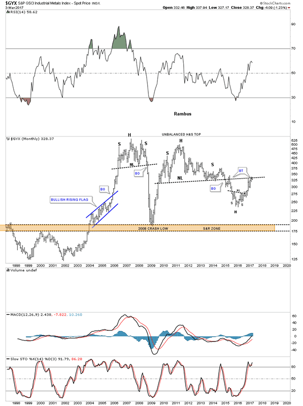
This next chart is a 20 year look at the $GYX which is an industrial metals index that has been backtesting the neckline from the previous H&S top. Another critical area to keep a close eye on.
GYX Monthly Chart
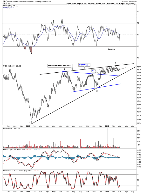
Of all the different commodities indexes out there the DBC is probably the most actively traded one. Here too you can see the possible bearish rising wedge building out. The blue triangle failed to deliver the impulse leg up that should have taken the price action much higher.
DBC Daily Chart
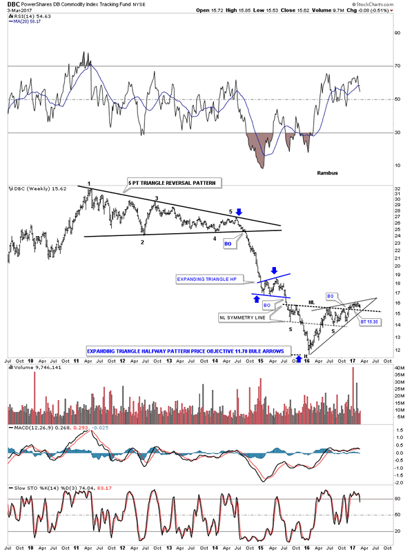
Like the other commodities indexes we looked at, is the DBC building out an inverse H&S bottom or the bearish rising wedge? Each pattern will have a profound effect on which way the price action will go, the inverse H&S bottom up and the rising wedge down.
DBC Weekly Chart
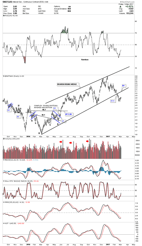
There is one commodity that has broken out below the bottom rail of a bearish rising wedge, which is the $NATGAS index. About 3 weeks ago the price action gapped below the bottom rail of the rising wedge with a quick backtest 2 days later. I can't rule out a backtest to the bottom rail at some point. Note the complex bottom that formed at the 2016 low at the end of that massive impulse leg down.
Natural Gas Daily Chart
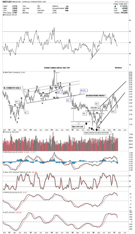
The weekly chart for NATGAS shows the big H&S top which led to the big impulse leg down which had a price objective down to the 1.86 area. The big question we have to ask, is this just a bear market rally out of the 2016 low?
Natural Gas Weekly Chart
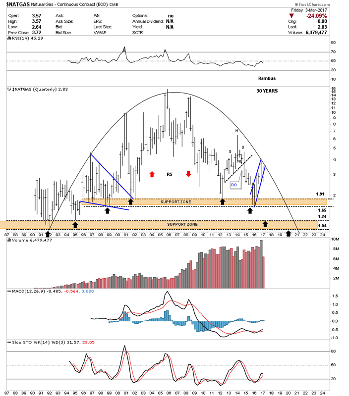
Below is a 30 year quarterly chart for NATGAS which shows the price action testing the top of the brown shaded S&R zone during the big decline that ended at the 2016 low. As you can see it now has been tested two times since 2012. The black arrows shows how it could reverse symmetry all the way down to its all time low around the 104 area. It's not going to happen over night because this a a long term quarterly chart, but the possibility exists.
Natural Gas Quarterly Chart
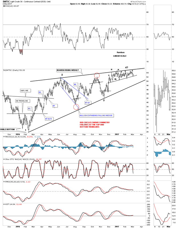
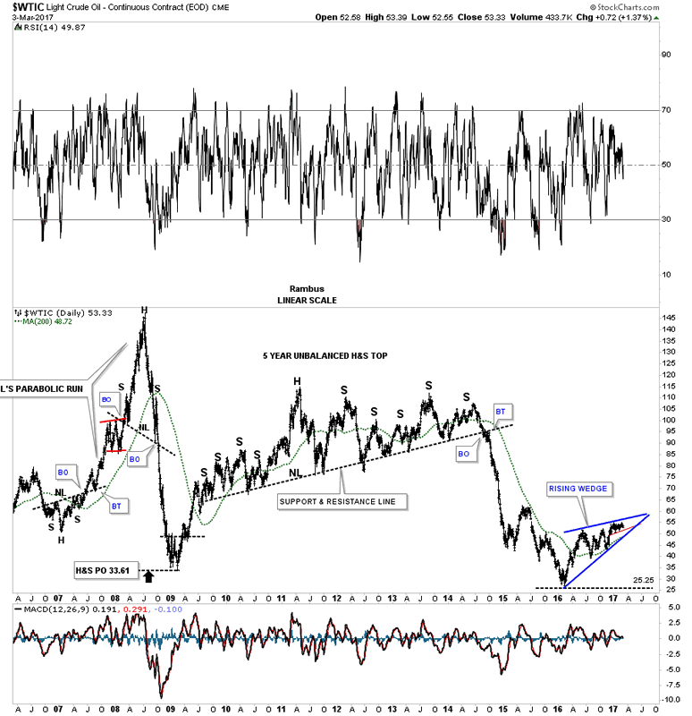
Now lets look at a daily chart for the $WTIC, oil index, which also shows a potential bearish rising wedge building out. Just like the CRB index the price action has been chopping around in a very tight trading range just below reversal point #4. Last Friday the price action tested the bottom rail of the small trading range for the 5th time telling us that rail is hot. These types of patterns can wear your patience out waiting for a breakout. If the WTIC breaks below the bottom rail of the rising wedge the price objective would be down to the previous February 2016 low.
Light Crude Oil Daily Chart
This next chart is a 10 year daily look at WTIC which shows the massive H&S top which led to the big oil decline into the 2016 low. That massive H&S top went on and on and on before it finally gave way. The pattern I showed you on the daily chart above at reversal point #4 could be considered a fractal to the massive H&S top on the chart below. The red trendline inside the rising wedge would be the fractal. How long will it take for the smaller daily H&S top to complete is unknown, but it will probably take longer than we think.
Light Crude Oil Daily Chart 2
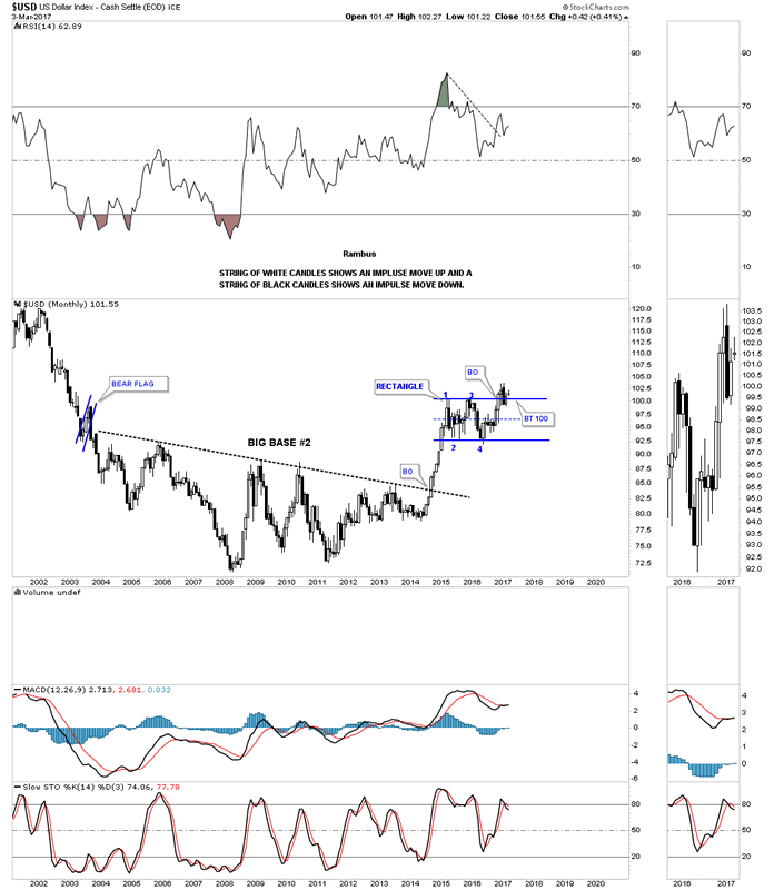
This last chart for tonight is a 15 year monthly chart for the US dollar. What we know for a fact is that the possible bearish scenarios on all the charts we looked at above won't take place if the US dollar declines. The commodities will only decline if the US dollar rallies, so the bulk of the proof lies with the US dollar. How the US dollar goes, so will the commodities complex. All the best...Rambus
US Dollar Index Monthly Chart
All the best
Gary (for Rambus Chartology)
FREE TRIAL - http://rambus1.com/?page_id=10
© 2017 Copyright Rambus- All Rights Reserved
Disclaimer: The above is a matter of opinion provided for general information purposes only and is not intended as investment advice. Information and analysis above are derived from sources and utilising methods believed to be reliable, but we cannot accept responsibility for any losses you may incur as a result of this analysis. Individuals should consult with their personal financial advisors.
© 2005-2022 http://www.MarketOracle.co.uk - The Market Oracle is a FREE Daily Financial Markets Analysis & Forecasting online publication.