


Commodity Markets Crash Catastrophe Charts
Commodities / Commodities Trading Apr 24, 2020 - 05:02 PM GMT

After a long term bear market in most commodity related stocks we are starting to hear analyst talk about inflation. From a Chartology perspective the deflationary scenario is still in play but how much lower can this sector go? In tonights Weekend Report, I’m going to update some long term commodity charts we’ve been following for years to see where they are currently trading in their bear cycle.
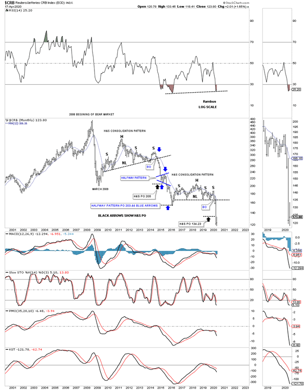
Lets begin by looking at one of the most widely followed commodity indexes the CRB. This 20 year monthly chart clearly shows the bear market began in July of 2008 which puts the age of its bear market at 12 years and counting. The initial crash, out of the 2008 high, was the same crash that the stock markets and PM complex experienced. The countertrend rally out of the 2009 crash low setup the next important high in the ongoing bear market which was the 5 year H&S consolidation pattern. The impulse move out of that 5 year H&S consolidation pattern took the CRB index down to the January 2016 low where we saw another countertrend rally that concluded in May of 2018 forming the head of the 4 year H&S consolidation pattern. The H&S neckline gave way in February of this year and has reached the minimum H&S price objective at 134.23. The CRB index has now reached an important point within its impulse move down where we could see either another small consolidation pattern start forming, similar to the blue expanding triangle halfway pattern in 2005, or some type of reversal pattern.
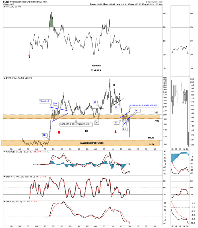
This is what I wrote back on August 23, 2019. This next chart for the CRB index is the infamous 75 year quarterly chart which shows the trading range that formed between the mid 1950’s to the early 1970’s. This chart shows how the H&S top and the bearish rising wedge fits into the big picture which could have serious negative consequences for the CRB index. If the current bearish rising wedge fulfills its measured move as a halfway pattern to the downside the CRB index will be trading all the way down into the brown shaded support zone using the BO to BO method. Just measure from the breakout below the neckline to the first reversal point in the 2016 bearish rising wedge. Then just take that measurement and add it to the breakout point of the 2016 bearish rising wedge to get your price objective. As you can see the current price action is now approaching the top of the brown shaded support zone which goes all the way back to the mid 1970’s.
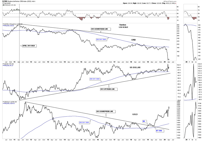
This next chart is a long term weekly combo chart which has the CRB index on top, with the US dollar in the middle and gold on the bottom. Since 2011 the CRB index has been moving inversely to the US dollar while gold has been moving generally up with the US dollar since the 2016 low. At this point a strong US dollar is still playing havoc with the commodities in general but not so much for gold.
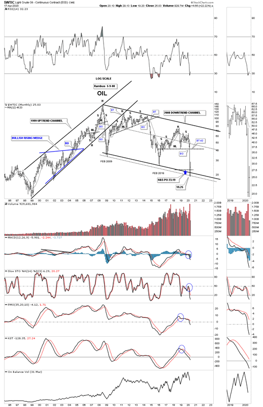
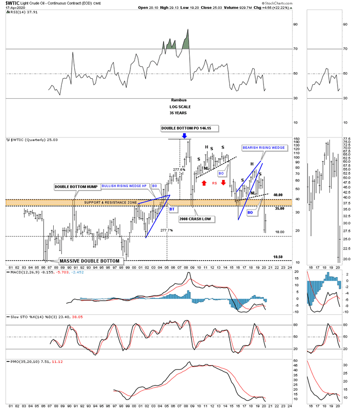
One of the most important commodities on the planet is oil, WTIC. Since the parabolic move that ended at the 2008 high WTIC has been in a severe bear market going from 147 to the recent low just under 20. What is most interesting about this long term monthly chart is how the recent low came in at the H&S measured move price objective down to the 23.19 area which was also the bottom rail of the 2008 downtrend channel. I’m keeping a close eye on the shorter term daily chart looking for some type of reversal or consolidation pattern to form.
Just like the long term quarterly chart for the CRB index we looked at earlier the WTIC has a very similar pattern that goes all the way back to 1981 when the low in oil was 10.81. Note the massive double bottom which projected a move of 277% which was just a dollar or so off the all time high. I’ve often explained what a classic H&S top is. They start out with a rising wedge where the left shoulder and head form inside of the rising wedge with the right shoulder high forming close to the breakout point on the backtest to the bottom rail of the rising wedge. The short oil trade was our best performing leveraged trade during the 2020 crash.
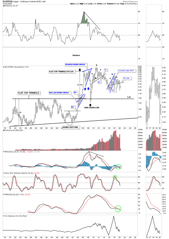
Since we are looking at long term quarterly charts for commodities we shouldn’t be surprised that many have similar looking charts. This long term quarterly chart for Copper shows a similar look to the WTIC which shows its recent H&S top is also a classic H&S top. You can also see the massive base that began to develop back in the late 1970’s which broke out to the topside in the middle of 2005 and reached its price objective at 3.81. Note how the 2008 crash found support right on top of that massive flat top expanding triangle.
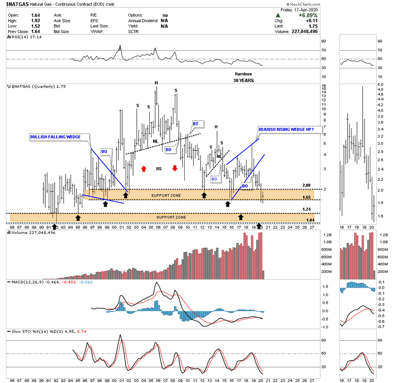
NATGAS, natural gas, is setup a bit differently in regards to its long term chart. The bear market for natural gas actually began in 2005 and has made a series of long term lower highs. When I first built this chart I put in two brown shaded support and resistance zones as the reverse symmetry was playing out so beautifully as shown by the back arrows. The upper brown shaded support zone has held support going all the way back to 1995. Is it going to hold support in 2020?
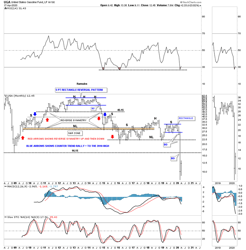
When we first opened up our doors at Rambus Chartology I would show this chart for UGA, gasoline, on Friday night after the market closed for the weekend. The trading range at the top of the chart ended up being a 5 point rectangle reversal pattern which ended up being the head for multiple H&S tops.
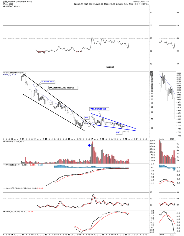
Lets finish up by looking at some different commodities and indexes. Last month the URA broke below the bottom rail of its 2016 falling wedge. So far this month the URA has managed to rally back up into the falling wedge negating the breakout for now. A move above the 30 week ema would help with a bullish outcome which is just overhead.
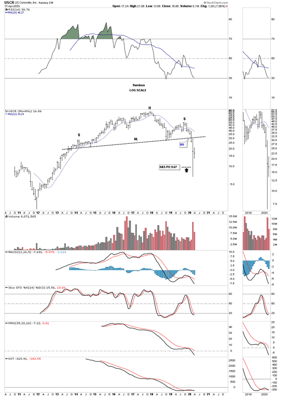
USCR, US concrete, has just achieved the minimum price objective for its H&S top after its massive bull market that began in late 2011.
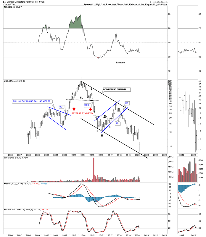
LL, lumber, has just hit the bottom rail of its 2013 downtrend channel.
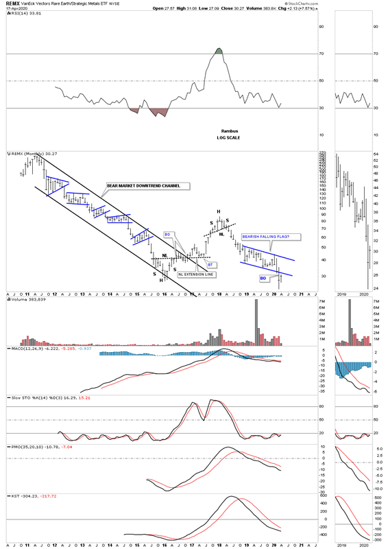
The REMX, Rare Earth etf, has experienced one countertrend rally during its lifetime going back to the 2011 high. Last month the price action broke below the bottom rail of a falling flag formation which is generally a bad sign unless the bulls come to the recuse and rally REMX back into the falling flag at a minimum.
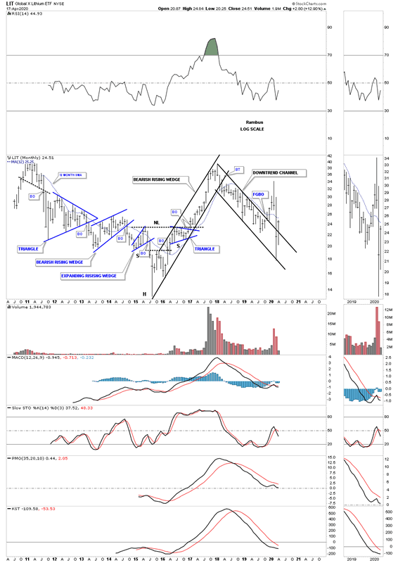
After putting in a false breakout gap last November the LIT, lithium etf, the price action negated that breakout when it traded back into the downtrend channel. This month the LIT is attempting to breakout again trading back above the top rail.
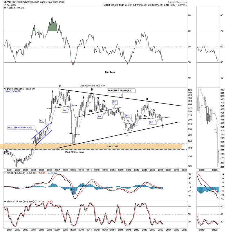
The GYX, industrial metals index, is trying to find support on the bottom rail of its massive 2005 triangle.
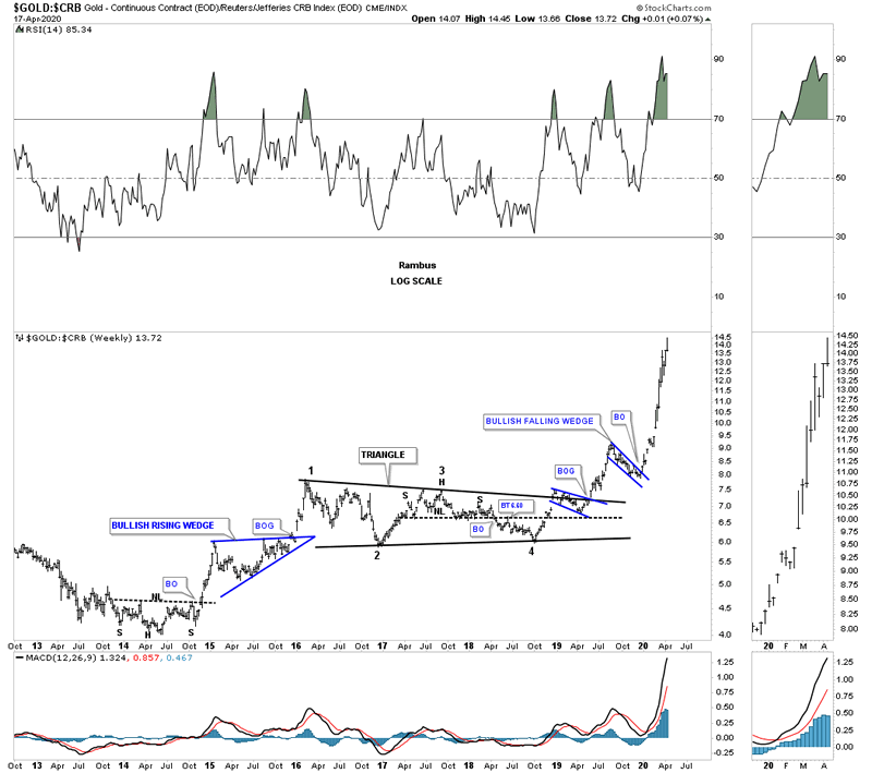
Below is a ratio chart that compares gold to the CRB index. How much longer can gold outperform the CRB index in such a big way?
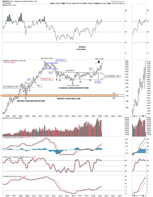
This last chart for tonight is a long term monthly chart for gold with the 2013 golden neckline. This month the 2013 H&S consolidation pattern minimum price objective has been met a 1791.
The bottom line is that most commodities have been in a bear market since their 2008 highs. Now most have reached their minimum long term price objectives which puts them at a critical inflection point where they can form a consolidation pattern to the downside which would most likely complete their bear markets. On the other hand they could be either starting to form a reversal pattern of some kind which could end their bear markets. Keep an open mind watching the shorter daily charts to see what kind of pattern builds out. Stay safe and all the best…Rambus
All the best
By Rambus Chartology
FREE TRIAL - http://rambus1.com/?page_id=10
© 2020 Copyright Rambus- All Rights Reserved
Disclaimer: The above is a matter of opinion provided for general information purposes only and is not intended as investment advice. Information and analysis above are derived from sources and utilising methods believed to be reliable, but we cannot accept responsibility for any losses you may incur as a result of this analysis. Individuals should consult with their personal financial advisors.
© 2005-2022 http://www.MarketOracle.co.uk - The Market Oracle is a FREE Daily Financial Markets Analysis & Forecasting online publication.